# native-shell
> native-shell: AI-generated UI, native in your app. iOS and Android apps load TSX modules at run time — signed, sandboxed by the host, and rendered with real UIKit and Android views.
Apps are TSX modules run by QuickJS on a native Rust runtime; the toolchain is the single `nsh` binary (`nsh init my-app`, `nsh run my-app/App.tsx`). Every page below is also served as Markdown at its URL plus `.md`.
---
# Introduction
native-shell (nsh for short) is designed for **AI-generated, dynamically delivered native UI**. A model writes a small module in TSX, and a native iOS or Android app that has already shipped loads it at run time and shows it with the platform's own views, inside a sandbox the app controls. The same mechanism makes native apps extensible in general — plugins, features, whole screens delivered after release. Mobile clients are the first target; desktop clients come next, through a GPUI backend that is in development.
> [!IMPORTANT]
> nsh is not a framework for writing your whole app in TypeScript. The app stays a native app, built and released the way it always was; nsh is the layer inside it for UI that is generated, changed or added after it ships.
## Why it exists
**First: UI generated by AI.** An assistant inside your app can answer with an interface rather than with text. A model writes a small TSX module (a form, a chart, a booking card), your server checks, builds and signs it, and the app downloads it and shows it in an `NshAppView`: native UI, sandboxed, limited to what you granted, and with no app update. nsh is built around this use, so its design is AI friendly throughout:
- **A format models write well.** A module is one TSX file using signals, a handful of host elements and Tailwind classes — the vocabulary models already know from the web, with no build configuration and no `node_modules`.
- **A precise, generated contract.** Every element, prop, style key and module has TypeScript declarations generated from the Rust sources (`.nsh/types`), so generated code can be type-checked, and a model can be given the exact API instead of guessing. These docs are also served as plain text for models ([`llms.txt`](/llms.txt), [`llms-full.txt`](/llms-full.txt)).
- **Checkable before it ships.** `nsh trace` runs a module headless, without a device, and reports errors and the views it produced; build errors come with a code frame. A generation loop can compile, run, read the result and retry. The compiler also runs in-process as a library (`nsh_bundler::compile_module`) and in the browser ([Playground](/playground)).
- **Safe to run when it is not trusted.** Generated code is untrusted code. Each module runs in its own QuickJS VM with memory, call-time and node limits, reaches only the capabilities the host grants, and arrives as a signed package the app verifies first.
- **Native without native code.** The output is real UIKit and Android views, with the system's text, input and accessibility, yet the model never writes Swift, Kotlin or Java, and the app never needs a new release.
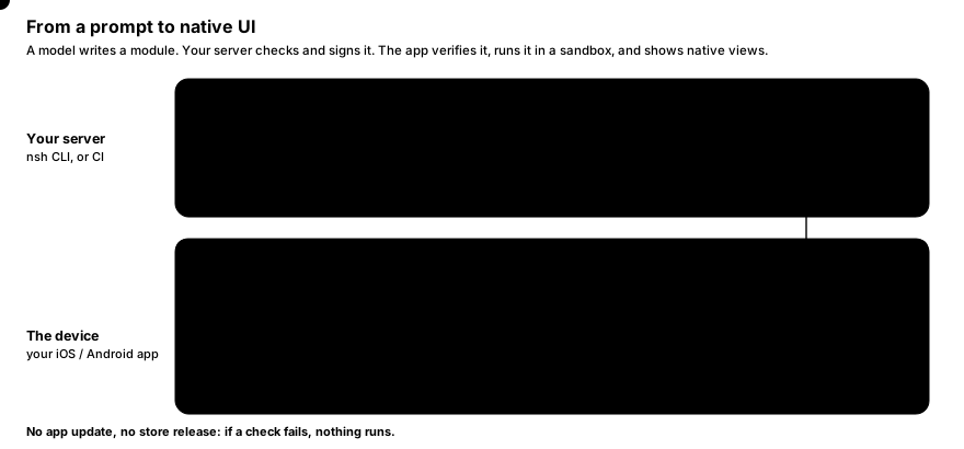
**Second: extending native apps, and delivering UI dynamically.** The same mechanism serves any module, not only generated ones. The app embeds an `NshAppView` (iOS) or `NshView` (Android) wherever a module should appear, and nsh runs the module inside it:
- **Delivered after release.** A module is a signed package (`.nshpkg`) the app downloads at run time. The app checks its signature against the keys it trusts and against a revocation list before running it ([Signed packages](https://native-shell.com/docs/signed-packages.md)). A change needs no new binary and no store release.
- **The host stays in control.** Each module runs in its own sandboxed VM, with memory, time and node limits, and reaches only what the host grants: network hosts, web pages, the status bar ([Sandbox and capabilities](https://native-shell.com/docs/sandbox-and-capabilities.md)). Several modules can run side by side; there are no global singletons.
- **It looks like the rest of the app.** Modules render real UIKit and Android views, so text, input, accessibility and scrolling are the system's own. The host can register its own native views — a map, a player, a design-system component — for modules to use ([Native components](https://native-shell.com/docs/native-components.md)).
**Third: standalone apps.** The same modules can also be a whole app. `nsh package` turns them into an installable iOS or Android app with the prebuilt runtime, which is also the quickest way to try nsh: the [getting started](https://native-shell.com/docs/getting-started.md) guide does exactly that. It is a supported use, but not the one nsh is designed around.
## Why native-shell, next to GPUI Shell
[Longbridge](https://longbridge.com) is building nsh as the plugin layer of its mobile client, and its desktop client needs the same layer. [GPUI Shell](https://gpui-kit.com/shell) makes [GPUI](https://gpui-kit.com) desktop apps extensible in JavaScript, and the first idea was to use it on phones too. It does not fit there, because its modules are drawn by GPUI itself, on the GPU, not with the platform's views:
- **System behavior would have to be rebuilt.** A self-drawn surface inside a native screen has none of the platform's text selection, nor the selection menu that comes with it (Copy, Share, Translate, Look Up, Select All), nor the system's input methods, accessibility and new visual materials each iOS release brings. Recreating them in a GPU renderer is a large, never-finished job, and the copies drift from the real thing.
- **Mobile teams would have to adopt a new UI stack.** Running a self-drawn layer at scale in an existing mobile client means its iOS and Android teams take on an unfamiliar renderer, its compatibility issues across OS versions and devices, and its bugs.
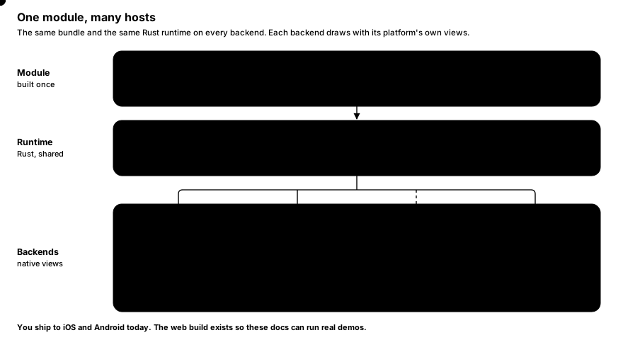
nsh therefore renders modules with UIKit and Android views, so a module behaves like the rest of the app because it is made of the same views: one module format and one runtime, on UIKit and Android views today, and on GPUI for desktop clients once its backend lands, so a module written once can run in all three clients.
The two are positioned differently. GPUI Shell is for extending GPUI desktop applications; native-shell is for extending native mobile apps, and through the GPUI backend, desktop clients as well. Native macOS and Windows backends (AppKit, WinUI) are not a goal for now.
## A module
A module is TypeScript and JSX:
```tsx
import { mount, signal, Text, View } from "nsh";
function Counter() {
const count = signal(0);
return (
{count()} count.update((n) => n + 1)}
activeOpacity={0.6}
class="rounded-lg bg-blue-600 px-5 py-3"
>
Tap
);
}
mount(Counter);
```
`` becomes a `UIView` or an Android `ViewGroup`, `` a native text view, and the button's press feedback (`activeOpacity`) runs on the main thread without a round trip to JavaScript. When you tap, `count.update` changes one signal, and only the text that reads `count()` is updated: the component function does not run again.
The host app shows it with a few lines of native code ([iOS](https://native-shell.com/docs/embedding-ios.md), [Android](https://native-shell.com/docs/embedding-android.md)):
```swift
let app = NshAppView() // a UIView: place it anywhere
try app.grantCapabilities(#"{ "network": { "hosts": ["api.example.com"] } }"#)
let info = try await app.loadPackage(at: downloadedFile, trust: trust) // verified, then run
```
Only the module's code is JavaScript. Everything it calls into — the reactive graph, the renderer, layout, text and every module it imports — is native, written in Rust.
## How a module runs
A module (an "app" in the CLI's terms) is a set of `.tsx` / `.ts` files with an entry, usually `App.tsx`. The toolchain is a single `nsh` binary:
1. **Build.** `nsh` bundles the module's files (with rolldown and Oxc) and compiles the JSX with its own compiler. Imports of `nsh` and `nsh/*` stay imports: the runtime serves them natively, so the bundle holds only your code. The bundle is compiled to QuickJS bytecode.
2. **Run.** On the device, the engine thread runs the bytecode in [QuickJS](https://github.com/quickjs-ng/quickjs). Compiled JSX calls the native renderer directly; changes are collected during one JavaScript turn, laid out with [Taffy](https://github.com/DioxusLabs/taffy) (flexbox and CSS grid), and handed to the main thread as one batch of view operations per frame.
3. **Render.** The main thread applies the batch to native views. Text is measured and laid out once on the engine thread (CoreText on Apple platforms, `StaticLayout` on Android) and only drawn on the main thread.
Because JavaScript only describes the UI and handles events, the work done in the interpreter is small. Parsing styles, resolving Tailwind classes, diffing, layout and text all happen in Rust.
> [!NOTE]
> The main thread never waits for JavaScript. Questions the system asks synchronously (may this input accept another character, may the user swipe back, may this sheet close) are answered natively from props you set beforehand, such as `maxLength`, `preventBack` or `dismissible`. Events reach your code afterwards.
## What you get
- **Embedding.** `NshAppView` (Swift) and `NshView` (Java/Kotlin) put a module anywhere in a native screen, as many as you like ([iOS](https://native-shell.com/docs/embedding-ios.md), [Android](https://native-shell.com/docs/embedding-android.md)).
- **Signed, revocable delivery.** Ed25519-signed packages, release keys certified by an offline root key, revocation lists ([Signed packages](https://native-shell.com/docs/signed-packages.md)).
- **A sandbox the host configures.** VM limits and capabilities granted per view ([Sandbox and capabilities](https://native-shell.com/docs/sandbox-and-capabilities.md)).
- **The host's own views in modules.** Register native components from Swift, Java or Rust ([Native components](https://native-shell.com/docs/native-components.md)).
- **Native views.** Embedding a native map, web view or video player has no layering problems, accessibility uses the platform's own tree, and text input is the system's.
- **Fine-grained reactivity.** [Signals](https://native-shell.com/docs/reactivity.md) like Solid's, implemented natively. Components run once; only the expressions that read a changed signal run again.
- **Styles and Tailwind**, resolved natively: flexbox, CSS grid, shadows, gradients, filters, transitions ([Styling](https://native-shell.com/docs/styling.md), [Tailwind](https://native-shell.com/docs/tailwind.md)).
- **A mobile UI set** (`nsh/ui/mobile`) whose components are written in Rust and look the same on iOS and Android: [Button](https://native-shell.com/components/button.md), [Card](https://native-shell.com/components/card.md), [ListView](https://native-shell.com/components/list-view.md), [navigation](https://native-shell.com/components/navigation.md), and more.
- **One binary toolchain.** No Node.js and no `node_modules`; `nsh` builds modules, writes their type declarations, serves them with hot module replacement, packages and signs them.
## Where it runs
| Platform | Status | Notes |
|---|---|---|
| iOS | Supported (iOS 15.0+) | Devices and the simulator; embedded with `NativeShell.xcframework` |
| Android | Supported (API 28, Android 9+) | `arm64-v8a` and `x86_64`; embedded with `nsh.aar` |
| Mac Catalyst | Development only | The iPhone-sized window `nsh run` opens on a Mac |
| Web (WebAssembly) | Demos only | Runs the examples on this site, drawn with the DOM rather than native views ([Web](https://native-shell.com/docs/web.md)); not a target to ship to |
| Desktop (GPUI) | In development | A [GPUI](https://gpui-kit.com) backend, so the same modules and runtime can build dedicated desktop clients |
## How it compares
The usual ways to put UI into a mobile client after release are web views, server-driven UI described in JSON, and mini-program containers. An nsh module renders native views where a web view renders a page, carries its own state and logic where a server-driven schema can only recombine built-in components, and runs in a sandbox the host configures in code. [Comparing approaches](https://native-shell.com/docs/comparison.md) goes through each.
## Next steps
- [Embedding in iOS apps](https://native-shell.com/docs/embedding-ios.md) and [Embedding in Android apps](https://native-shell.com/docs/embedding-android.md): host modules in your app.
- [Signed packages](https://native-shell.com/docs/signed-packages.md) and [Sandbox and capabilities](https://native-shell.com/docs/sandbox-and-capabilities.md): deliver modules and decide what they may do.
- [Installation](https://native-shell.com/docs/installation.md) and [Getting started](https://native-shell.com/docs/getting-started.md): get `nsh` and write a first module (run as a standalone app).
- [JSX and components](https://native-shell.com/docs/jsx-and-components.md) and [Reactivity](https://native-shell.com/docs/reactivity.md): the two ideas everything else builds on.
Source: https://native-shell.com/docs
---
# Installation
Everything nsh does goes through one command, `nsh`. It bundles and compiles apps, runs the dev server, launches development hosts and packages installable apps. You can use it from a prebuilt distribution, which needs no Rust, or build it from a checkout of the repository.
On top of `nsh`, each target needs the platform's own tools: Xcode for iOS and Mac Catalyst, the Android SDK for Android.
## The prebuilt distribution
The distribution is a directory, `dist/nsh`, with the CLI and the prebuilt native runtimes it packages apps with:
```sh
dist/nsh/bin/nsh # the CLI
dist/nsh/runtime/ios/iphoneos/nsh-ios-app # runs packaged apps on iOS devices
dist/nsh/runtime/ios/iphonesimulator/{nsh-ios-app,nsh-ios-host}
dist/nsh/runtime/ios/maccatalyst/nsh-ios-host # the Mac Catalyst development host
dist/nsh/runtime/android/{release,dev}/ # classes.dex, lib//libnsh.so
dist/nsh/embed/ios/{NativeShell,NativeShellDev}.xcframework # embedding in iOS apps
dist/nsh/embed/android/{nsh,nsh-dev}.aar # embedding in Android apps
```
Put `dist/nsh/bin` on your `PATH` (or call `dist/nsh/bin/nsh` directly) and keep the directory together: `nsh` finds the runtimes next to itself, in `bin/../runtime`.
```sh
export PATH="$PWD/dist/nsh/bin:$PATH"
nsh --version
```
The distribution is made with `cargo xtask dist` in a checkout (below). It builds the iOS runtimes, so it has to run on a Mac with Xcode, and the `nsh` binary it contains is built for that machine (Apple Silicon).
## Building from a checkout
You need Rust through [rustup](https://rustup.rs). The repository's `rust-toolchain.toml` selects the stable toolchain and installs the iOS and Android targets on first use.
```sh
git clone https://github.com/longbridge/native-shell.git
cd native-shell
cargo build -p nsh-cli # ./target/debug/nsh
```
Then build the development host of each target you want to run on, once, and again after you update the checkout:
```sh
cargo build -p nsh-ios-host --target aarch64-apple-ios-macabi # nsh run (Mac Catalyst window)
cargo build -p nsh-ios-host --target aarch64-apple-ios-sim # nsh run --target ios
cargo xtask android --dev # nsh run --target android
```
For `nsh package`, build the release runners as well:
```sh
cargo build -p nsh-ios-app --target aarch64-apple-ios-sim # nsh package --target ios-simulator
cargo build -p nsh-ios-app --target aarch64-apple-ios # nsh package --target ios
cargo xtask android # nsh package --target android
```
A CLI built from a checkout looks for the runtimes in `target//` and `target/android/[-dev]`, using its own profile: `./target/debug/nsh` uses debug runtimes, `./target/release/nsh` release ones. Build both with the same profile (add `--release` to all of them for faster apps).
> [!TIP]
> `NSH_RUNTIME=/path/to/runtime` makes `nsh` use a runtime directory laid out like the distribution's `runtime/`, wherever the CLI itself lives.
## Platform tools
### iOS and Mac Catalyst
- **Xcode** (with its command line tools). `nsh run` uses `xcrun simctl` to boot simulators and install the development host; `nsh package` uses `actool` for app icons and `codesign` for signing.
- An iOS simulator runtime. If none is installed, install one with `xcodebuild -downloadPlatform iOS`.
- Apps target iOS 15.0 and later.
### Android
- **The Android SDK**, found through `ANDROID_HOME`, `ANDROID_SDK_ROOT` or `~/Library/Android/sdk`, with:
- `platforms;android-35` and a recent `build-tools` (nsh uses `aapt2`, `zipalign` and `apksigner` from it, no Gradle);
- `platform-tools` (`adb`).
- **A JDK** (`keytool` creates the debug keystore in `~/.android/debug.keystore` the first time you package, `apksigner` needs Java).
- A running emulator or a device connected over `adb`. Apps need Android 9 (API 28) or later.
```sh
sdkmanager "platforms;android-35" "build-tools;35.0.1" "platform-tools"
```
Building the Android runtime from a checkout (`cargo xtask android`) additionally needs an **NDK** from the SDK (`ndk;`; set `ANDROID_NDK_HOME` if the newest one installed is incomplete) and `javac`.
## What works where
| Command | macOS | Linux |
|---|---|---|
| `nsh init`, `nsh build`, `nsh trace`, `nsh dev` | Yes | Yes |
| `nsh run` (Mac Catalyst, the default) | Yes | No |
| `nsh run --target ios`, `nsh package --target ios` / `ios-simulator` | Yes, with Xcode | No |
| `nsh run --target android`, `nsh package --target android` | Yes | Yes, from a checkout |
| `nsh keygen`, `certify`, `publish`, `verify`, `revoke` | Yes | Yes |
On Linux, build the CLI and the Android runtime from a checkout (`cargo build -p nsh-cli` and `cargo xtask android --dev`); the NDK's Linux toolchain is used automatically. Building the Android runtime supports macOS and Linux hosts only.
## Editor setup
nsh needs no `node_modules`. `nsh init` writes a `tsconfig.json` and the type declarations of everything nsh provides into `.nsh/types`, and every command that builds the app keeps them up to date. Any editor that uses the TypeScript language server (VS Code, Zed, Neovim, WebStorm) type-checks the app with them. See [Project structure](https://native-shell.com/docs/project-structure.md#tsconfigjson-and-nshtypes).
## Next steps
Continue with [Getting started](https://native-shell.com/docs/getting-started.md) to create an app and run it.
Source: https://native-shell.com/docs/installation
---
# Getting started
nsh's main use is hosting modules inside a native app (see [Introduction](https://native-shell.com/docs.md)). This guide follows that path: write a module, develop it with hot reload, show it in your iOS or Android app, and ship an update as a signed package. It assumes `nsh` is installed and on your `PATH` ([Installation](https://native-shell.com/docs/installation.md)); in a checkout, use `./target/debug/nsh` instead.
> [!TIP]
> No app project at hand? The first two sections need none: `nsh run` shows the module in nsh's own development host on the Mac, the iOS simulator or Android. You can stop there, or [package it as a standalone app](#or-ship-it-as-a-standalone-app).
## Create a module
```sh
nsh init my-app
```
A module is what a host app loads: one or more `.tsx` files with an entry. `nsh init` creates the directory if it is missing and writes:
| File | What it is |
|---|---|
| `App.tsx` | The entry module: renders the app with `mount` |
| `nsh.json` | The app's name, id, version and build number ([Project structure](https://native-shell.com/docs/project-structure.md#nshjson)) |
| `tsconfig.json` | TypeScript settings that resolve `nsh` to the declarations in `.nsh/types` |
| `.gitignore` | Ignores `.nsh/` and `out/` |
| `.nsh/types/` | Generated declarations of every nsh module, for your editor |
The display name defaults to the directory's name; pass `--name "My App"` to choose another. The id becomes `com.example.`: change it in `nsh.json` before you ship. Files that already exist are kept, so you can run `nsh init` in a directory that has some of them.
### The entry module
```tsx
import { mount, signal, Text, View } from "nsh";
import { SafeAreaView } from "nsh/ui/mobile";
function App() {
const count = signal(0);
return (
{count()} count.update((c) => c + 1)}
activeOpacity={0.6}
accessibilityRole="button"
style={{ paddingHorizontal: 20, paddingVertical: 12, borderRadius: 10, backgroundColor: "#0969da" }}
>
Tap
);
}
mount(App);
```
Line by line:
- **`import { mount, signal, Text, View } from "nsh"`**: `nsh` is the core module: [signals](https://native-shell.com/docs/reactivity.md), `mount`, the other reactive primitives, and the host elements `View` and `Text`. It is served by the native runtime, not bundled.
- **`import { SafeAreaView } from "nsh/ui/mobile"`**: the mobile UI set. [`SafeAreaView`](https://native-shell.com/components/safe-area-view.md) pads its content so it stays clear of the notch, the status bar and the home indicator.
- **`function App()`** is a component: a function that returns JSX. It runs **once**. `signal(0)` makes a value that changes over time.
- **`{count()}`** reads the signal inside JSX. The compiler sees a call and makes this text follow the signal: when `count` changes, the runtime updates this one text, nothing else.
- **``** is a native view that reacts to presses; `activeOpacity` fades it while pressed, natively. `View`, `Text`, `Image`, `Scroll`, `Input` and the other [host elements](https://native-shell.com/elements.md) are imported from nsh's modules, like any component; only `If` and `Each` need no import.
- **`style={{ … }}`** takes an object of camelCase style properties, with numbers in points. Layout is flexbox, and children stack in a column by default ([Layout](https://native-shell.com/docs/layout.md)).
- **`mount(App)`** renders the component into the app's surface.
> [!IMPORTANT]
> Text must be inside ``. A bare string in a `` (`Hello`) is not displayed.
## Develop it
### Run it
`nsh run` starts a dev server, builds the app, launches a development host that loads it, and keeps rebuilding while you edit. Logs from the app (`console.log`, errors) appear in the terminal.
#### Mac Catalyst (default)
```sh
nsh run my-app/App.tsx
```
The app opens in an iPhone-sized window (390×844 points) on your Mac. This is the fastest loop: no simulator to boot. It uses UIKit like iOS, so what you see is what an iPhone shows, apart from Mac-specific behavior such as scrolling with a mouse wheel.
#### iOS simulator
```sh
nsh run my-app/App.tsx --target ios
nsh run my-app/App.tsx --target ios --device "iPhone 16 Pro"
```
`nsh` uses a booted simulator, or boots the newest iPhone if none is running, and installs the development host into it. `--device` picks a simulator by name or UDID.
#### Android
```sh
nsh run my-app/App.tsx --target android
```
Start an emulator or connect a device first (`adb devices` lists them; nsh uses the first one). `nsh` installs a development host APK (rebuilt only when the runtime changes) and forwards the dev server's port to the device with `adb reverse`, so it works over USB without a shared network.
### Edit with hot reload
Leave `nsh run` running and change the label in `App.tsx`:
```tsx
Add one
```
Save. The CLI rebuilds and sends a patch; the host runs the changed module again and renders again only the components whose code changed. Here that is `App`, which owns the `count` signal, so the count starts over. State survives when you edit a component that does not own it. Move the button into a component of its own:
```tsx
function TapButton(props: { onPress: () => void }) {
return (
Tap
);
}
```
Use ` count.update((c) => c + 1)} />` in `App`, tap a few times, then change `TapButton`'s color: the button updates and the count stays.
Hot replacement works per top-level component: a function with a capitalized name whose body contains JSX. A component renders again when its own code changes, or when the module's code outside components changes (a constant it uses, a helper). If an edit cannot be applied in place (for example, it imports an nsh module the running app did not import yet, or changes `nsh.json`'s capabilities), the host reloads the whole app.
#### Errors
A build error is printed in the terminal and shown on the device as a red overlay with the file, line and column; the app keeps running the last good build. The overlay disappears with the next successful build (tap it to dismiss it earlier). An exception thrown at run time is shown the same way, with its stack mapped back to your `.tsx` source.
## Host it in your app
Your app shows a module in a view of its own: `NshAppView` (a `UIView`) on iOS, `NshView` (an Android `View`) on Android. Place it like any other view, on any screen, as many times as you need. During development, point it at the dev server; in a release, load a built bundle or a downloaded package.
### iOS
Link `NativeShellDev.xcframework` in Debug and `NativeShell.xcframework` in Release ([Embedding in iOS apps](https://native-shell.com/docs/embedding-ios.md)), then:
```swift
import NativeShell
let app = NshAppView()
app.onError = { message in print("nsh error: \(message)") }
view.addSubview(app) // and constrain it like any view
#if DEBUG
try app.connectDevServer(URL(string: "ws://127.0.0.1:8790/ws")!) // `nsh dev my-app` on your Mac
#else
try app.loadBundle(at: Bundle.main.url(forResource: "bundle", withExtension: "qbc", subdirectory: "nsh")!)
#endif
```
`nsh dev my-app/App.tsx` serves the module to the app and pushes every save, as `nsh run` does with its own host. For the release build, `nsh build my-app/App.tsx --release --out MyApp/nsh` writes the bundle into a folder you add to the app's resources.
### Android
Add `nsh-dev.aar` for debug builds and `nsh.aar` for release builds ([Embedding in Android apps](https://native-shell.com/docs/embedding-android.md)), then:
```kotlin
val nsh = NshView(this)
nsh.setErrorListener { message -> Log.e("nsh", message) }
setContentView(nsh) // or add it to any layout
if (BuildConfig.DEBUG) {
nsh.connectDevServer("ws://127.0.0.1:8790/ws") // with `adb reverse tcp:8790 tcp:8790`
} else {
nsh.loadAssetBundle("nsh") // assets/nsh, from `nsh build my-app/App.tsx --release --out app/src/main/assets/nsh`
}
```
Before loading, the host decides what the module may do: `grantCapabilities` sets the network hosts and other capabilities it may reach, and limits cap its memory, call time and node count ([Sandbox and capabilities](https://native-shell.com/docs/sandbox-and-capabilities.md)). To give modules your own native views (a map, a chart, a design-system component), register them as [native components](https://native-shell.com/docs/native-components.md).
## Ship updates as signed packages
A module the app downloads after release comes as a signed package. Create a root key once and keep it offline, certify a release key with it, and publish:
```sh
nsh keygen keys/root && nsh keygen keys/release
nsh certify --root keys/root.secret --key keys/release.pub --apps 'com.example.*' -o keys/release.cert
nsh publish my-app/App.tsx --key keys/release.secret --cert keys/release.cert --build 2
```
The app trusts the root's public key and loads what it downloads; nsh verifies the signature, the certificate and the revocation list before running anything:
```swift
let support = FileManager.default.urls(for: .applicationSupportDirectory, in: .userDomainMask)[0]
let trust = try NshTrust(stateDirectory: support.appendingPathComponent("nsh"))
try trust.addRoot(rootPublicKey) // the contents of keys/root.pub
let info = try await app.loadPackage(at: downloadedFile, trust: trust)
```
Android has the same flow with `NshTrust` and `NshPackage`. Hosting, delivery and revocation in detail: [Signed packages](https://native-shell.com/docs/signed-packages.md).
## Or ship it as a standalone app
The same module can also be a whole app. `nsh package` builds an installable app around it from the prebuilt runtime, with no Xcode project or Gradle build of your own:
```sh
nsh package my-app --target ios-simulator --run
nsh package my-app --target android
```
This is a supported use, and the quickest way to put a module on a device, but nsh is designed around hosting modules in native apps. Options, signing and icons: [Packaging](https://native-shell.com/docs/packaging.md).
## Try it in the terminal
`nsh trace` runs an app headless (no device) and prints the native view operations it produces and their timings, then taps the first pressable view twice:
```sh
nsh trace my-app/App.tsx
```
It is a quick way to check that an app starts without errors, and to see how much work an interaction causes ([Testing and trace](https://native-shell.com/docs/testing-and-trace.md)).
## Next steps
- [Embedding in iOS apps](https://native-shell.com/docs/embedding-ios.md) and [Embedding in Android apps](https://native-shell.com/docs/embedding-android.md): the full host APIs.
- [Signed packages](https://native-shell.com/docs/signed-packages.md) and [Sandbox and capabilities](https://native-shell.com/docs/sandbox-and-capabilities.md): delivery and what modules may do.
- [JSX and components](https://native-shell.com/docs/jsx-and-components.md) and [Reactivity](https://native-shell.com/docs/reactivity.md): writing modules.
- [Project structure](https://native-shell.com/docs/project-structure.md): what goes in `nsh.json`, assets, files.
Source: https://native-shell.com/docs/getting-started
---
# Embedding in iOS Apps
An existing iOS app can show nsh apps inside its own UI. The runtime ships as `NativeShell.xcframework`, a static
framework with a Swift module: you create an `NshAppView` (a `UIView`), add it anywhere in your view hierarchy and load
an app into it. Your native screens, navigation and the nsh app live side by side in one UIKit hierarchy.
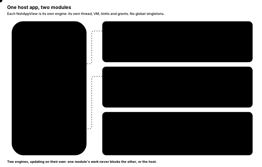
Each `NshAppView` is one independent engine with its own JS VM; there are no global singletons, so an app can show
several nsh apps at once, for example one per tab.
## Get the framework
The distribution contains both variants:
```text
dist/nsh/embed/ios/NativeShell.xcframework release: bundles and signed packages
dist/nsh/embed/ios/NativeShellDev.xcframework also connects to a `nsh dev` server
```
From a checkout of nsh you can build just the frameworks:
```sh
cargo xtask ios-embed # writes dist/nsh/embed/ios/{NativeShell,NativeShellDev}.xcframework
```
Each XCFramework has three arm64 slices: iOS devices, the iOS simulator (Apple silicon) and Mac Catalyst. The minimum
deployment target is iOS 15.0. The Swift module is compiled with library evolution, so apps built with other Swift
compiler versions can import it, and the framework links everything it needs: you add nothing else.
## Add it to an Xcode project
1. Drag `NativeShell.xcframework` (or `NativeShellDev.xcframework` for development builds) into the app target's
**Frameworks, Libraries, and Embedded Content**. It is a static framework, so choose **Do Not Embed**.
2. In Swift, `import NativeShell`.
> [!TIP]
> Link `NativeShellDev.xcframework` in the Debug configuration and `NativeShell.xcframework` in Release, so only
> development builds can connect to a dev server.
## Ship a bundle with the app
Build the nsh app into a folder and add that folder to the app's resources as a folder reference named `nsh`:
```sh
nsh build App.tsx --release --out MyApp/nsh
```
`nsh build` writes:
| File | Contents |
|---|---|
| `bundle.qbc` | The app compiled to QuickJS bytecode: the fastest to load. |
| `bundle.js` | The same app as JS source. |
| `bundle.js.map` | Its source map (stack traces point at your `.tsx` files). |
| `capabilities.json` | The [capabilities](https://native-shell.com/docs/sandbox-and-capabilities.md) the app declares, when `nsh.json` has any. |
| `assets/` | Images and fonts the app imports, at their paths relative to the entry. |
## Show the app
```swift
import NativeShell
import UIKit
final class EmbedController: UIViewController {
private let app = NshAppView()
override func viewDidLoad() {
super.viewDidLoad()
app.translatesAutoresizingMaskIntoConstraints = false
app.onError = { message in print("nsh error: \(message)") }
view.addSubview(app)
NSLayoutConstraint.activate([
app.topAnchor.constraint(equalTo: view.safeAreaLayoutGuide.topAnchor),
app.leadingAnchor.constraint(equalTo: view.leadingAnchor),
app.trailingAnchor.constraint(equalTo: view.trailingAnchor),
app.bottomAnchor.constraint(equalTo: view.bottomAnchor),
])
guard let url = Bundle.main.url(forResource: "bundle", withExtension: "qbc", subdirectory: "nsh") else { return }
do {
try app.loadBundle(at: url)
} catch {
print("cannot load: \(error)")
}
}
// Let the embedded app's StatusBar decide the status bar.
override var preferredStatusBarStyle: UIStatusBarStyle { NshAppView.preferredStatusBarStyle }
override var prefersStatusBarHidden: Bool { NshAppView.prefersStatusBarHidden }
override var preferredStatusBarUpdateAnimation: UIStatusBarAnimation {
NshAppView.preferredStatusBarUpdateAnimation
}
}
```
The view's size is the app's window: nsh lays the app out at the view's bounds and again whenever they change. Loading
again replaces the running app; the app stops when the view is deallocated.
The complete sample, a UIKit app that shows a nsh app below its own native header, is `examples/embed-ios/main.swift`.
## `NshAppView`
`NshAppView` is a `UIView` subclass isolated to the main actor.
| Member | Description |
|---|---|
| `init(frame: CGRect = .zero, trace: Bool = false)` | Creates the view. `trace` logs the time of every commit. `init?(coder:)` supports storyboards and nibs. |
| `onError: ((String) -> Void)?` | Receives fatal app errors (a bundle that fails to load, uncaught JS exceptions, a VM stopped by a limit) on the main thread. Errors are always logged; development builds also show them over the app. |
| `limits: NshLimits` | The VM limits of the apps loaded from now on. |
| `grantCapabilities(_ json: String?) throws` | The most the apps loaded from now on may do, as JSON in the form of `nsh.json`'s `capabilities`; `nil` grants what each app declares. Throws `NshError` for invalid JSON. |
| `loadBundle(at url: URL) throws` | Runs a bundle written by `nsh build`. Assets come from `assets/` next to it; `bundle.js.map` and `capabilities.json` next to it are read too. |
| `run(_ package: NshPackage)` | Runs a verified signed package (see below). A package runs once. |
| `loadPackage(at:trust:) async throws -> NshPackage.Info` | Verifies the package at a URL off the main thread, then runs it. Throws why it was refused; the running app stays. |
| `connectDevServer(_ url: URL) throws` | Development: loads from a `nsh dev` server and reloads on every change. Throws with `NativeShell.xcframework`, which has no development support. |
| `register(component:_:)` | Registers a [native component](https://native-shell.com/docs/native-components.md). |
| `static preferredStatusBarStyle`, `prefersStatusBarHidden`, `preferredStatusBarUpdateAnimation` | What the running apps asked for with `StatusBar`: return them from the hosting view controller's overrides. |
> [!IMPORTANT]
> `bundle.qbc` (bytecode) loads only from inside the app bundle. QuickJS does not validate bytecode, so bytecode from
> anywhere else could corrupt memory: for a file outside the app bundle, load `bundle.js` (JS source), or better, a
> [signed package](https://native-shell.com/docs/signed-packages.md).
`limits` and `grantCapabilities` apply from the next load: set them before `loadBundle` / `run`.
## Limits
```swift
app.limits = NshLimits(memoryMB: 128, callBudget: 1, maxNodes: 50_000)
```
| `NshLimits` field | Default | Meaning |
|---|---|---|
| `memoryMB: UInt32?` | 256 | JS heap in MB. Running out stops the app. |
| `stackKB: UInt32?` | 4096 (also the maximum) | Interpreter stack in KB. Deeper recursion throws a `RangeError`. |
| `loadBudget: TimeInterval?` | 10 s | Time to evaluate the bundle. |
| `callBudget: TimeInterval?` | 2 s | Time of any other call into JS (one event, one timer, one frame). An overrun call is cut off. |
| `maxNodes: UInt32?` | 200 000 | Nodes the app may keep. |
`nil` keeps the default. What each limit does when it is hit: [Sandbox and capabilities](https://native-shell.com/docs/sandbox-and-capabilities.md).
## Capabilities
An app declares what it may reach in its `nsh.json`; the embedding app can grant less. A request must be allowed by
both:
```swift
try app.grantCapabilities("""
{
"network": { "hosts": ["api.example.com", "*.cdn.example.com"] },
"webview": { "hosts": ["help.example.com"] }
}
""")
try app.loadBundle(at: url)
```
Here the app may not set the status bar (no `statusBar`), even if its `nsh.json` asks for it. Details:
[Sandbox and capabilities](https://native-shell.com/docs/sandbox-and-capabilities.md).
## Signed packages
To run code the app downloads (updates, third-party mini apps), use [signed packages](https://native-shell.com/docs/signed-packages.md):
`nsh publish` writes a `.nshpkg` signed by a release key that your root key certified, and the app verifies it before
running it.
```swift
let support = FileManager.default.urls(for: .applicationSupportDirectory, in: .userDomainMask)[0]
let trust = try NshTrust(stateDirectory: support.appendingPathComponent("nsh"))
try trust.addRoot(rootPublicKey) // the contents of root.pub from `nsh keygen`
Task {
do {
let info = try await app.loadPackage(at: downloadedFile, trust: trust)
print("running \(info.id) \(info.version) (build \(info.build))")
} catch {
print("refused: \(error)") // the running app stays
}
}
```
To verify first and run later, split the two steps:
```swift
let package = try await trust.openPackage(at: downloadedFile) // verifies off the main thread
// ... decide, ask the user, ...
app.run(package)
```
| API | Description |
|---|---|
| `NshTrust(stateDirectory: URL) throws` | Opens or creates the trust store. Its state (newest revocation list, highest build accepted per app) persists there, and packages' assets are extracted under it. Trusts no key until `addRoot`. Thread-safe. |
| `addRoot(_ publicKey: String) throws` | Trusts a root public key (base64, the contents of a `.pub` file). Several roots may be trusted. |
| `updateRevocations(_ json: String) throws` | Applies a revocation list written by `nsh revoke`, signed by a trusted root and newer than the one the store has. |
| `openPackage(at: URL) async throws -> NshPackage` | Verifies, extracts assets and accepts the package (older builds of that app are refused from then on). |
| `NshPackage.info` | `id`, `name`, `version`, `build` of the app inside. |
| `NshError` | The error every throwing call throws; `message` says why. |
## Development
With `NativeShellDev.xcframework`, point the view at a dev server instead of a bundle:
```swift
#if DEBUG
try app.connectDevServer(URL(string: "ws://127.0.0.1:8790/ws")!)
#else
try app.loadBundle(at: bundledURL)
#endif
```
Run `nsh dev App.tsx` on your Mac. The simulator shares the Mac's network, so `127.0.0.1` reaches the server; a
device uses the LAN address `nsh dev` prints (`devices on this network: ws://192.168.1.20:8790/ws`). Every save
updates the app in place, logs appear in the `nsh dev` terminal, and errors show over the app. See
[Dev server and debugging](https://native-shell.com/docs/dev-server-and-debugging.md).
> [!NOTE]
> On a device, the connection to your Mac is ordinary local network traffic over plain `ws://` and `http://` (assets).
> iOS may ask the user for local network access, and the app's App Transport Security settings must allow it.
## Notes
- **Threads.** `NshAppView` is main-actor isolated. `NshTrust`, `NshPackage` and `NshComponentContext` are thread-safe.
The JS engine runs on its own thread; the main thread never waits for it.
- **Status bar.** The embedded app's `StatusBar` changes what `NshAppView.preferredStatusBarStyle` and friends return;
the hosting view controller must forward them, as in the example above.
- **Safe area.** Apps use `SafeAreaView` or `useSafeAreaInsets()` from [`nsh/ui/mobile`](https://native-shell.com/components/safe-area-view.md)
as usual. An `NshAppView` placed below your own header gets the insets that apply to it, not the window's.
- **Mac Catalyst.** The same framework works in Catalyst apps.
## See also
- [Embedding in Android apps](https://native-shell.com/docs/embedding-android.md)
- [Native components](https://native-shell.com/docs/native-components.md)
- [Signed packages](https://native-shell.com/docs/signed-packages.md)
- [Sandbox and capabilities](https://native-shell.com/docs/sandbox-and-capabilities.md)
Source: https://native-shell.com/docs/embedding-ios
---
# Embedding in Android Apps
An existing Android app can show nsh apps inside its own UI. The runtime ships as an Android library, `nsh.aar`: you
create a `com.longbridge.nsh.NshView` (a `FrameLayout`), add it to any layout and load an app into it. The nsh app
renders with ordinary Android views next to your own.
Each `NshView` is one independent engine with its own JS VM; there are no global singletons, so several can run at
once.

## Get the library
The distribution contains both variants:
```text
dist/nsh/embed/android/nsh.aar release: bundles and signed packages
dist/nsh/embed/android/nsh-dev.aar also connects to a `nsh dev` server
```
The AAR holds the Java runtime and `libnsh.so` for `arm64-v8a` and `x86_64` (64-bit only). It declares the `INTERNET`
permission and needs **API 28** (Android 9) or newer.
Add it to the app module, for example from a `libs` folder:
```kotlin
// app/build.gradle.kts
dependencies {
debugImplementation(files("libs/nsh-dev.aar"))
releaseImplementation(files("libs/nsh.aar"))
}
```
## Ship a bundle with the app
Build the nsh app into the app's assets:
```sh
nsh build App.tsx --release --out app/src/main/assets/nsh
```
This writes `bundle.qbc` (bytecode), `bundle.js` (source), `bundle.js.map`, `capabilities.json` (when `nsh.json`
declares [capabilities](https://native-shell.com/docs/sandbox-and-capabilities.md)) and `assets/` (the images and fonts the app imports).
## Show the app
```java
import android.app.Activity;
import android.os.Bundle;
import android.util.Log;
import com.longbridge.nsh.NshView;
public final class MainActivity extends Activity {
private NshView nsh;
@Override
protected void onCreate(Bundle state) {
super.onCreate(state);
nsh = new NshView(this);
nsh.setErrorListener(message -> Log.e("nsh", message));
setContentView(nsh);
nsh.loadAssetBundle("nsh"); // runs assets/nsh/bundle.qbc
}
@Override
protected void onDestroy() {
nsh.destroy();
super.onDestroy();
}
}
```
In Kotlin:
```kotlin
class MainActivity : Activity() {
private lateinit var nsh: NshView
override fun onCreate(state: Bundle?) {
super.onCreate(state)
nsh = NshView(this)
nsh.setErrorListener { message -> Log.e("nsh", message) }
setContentView(nsh)
nsh.loadAssetBundle("nsh")
}
override fun onDestroy() {
nsh.destroy()
super.onDestroy()
}
}
```
`NshView` can also sit inside any layout, below your own toolbar for example:
```java
LinearLayout column = new LinearLayout(this);
column.setOrientation(LinearLayout.VERTICAL);
column.addView(toolbar);
column.addView(nsh, new LinearLayout.LayoutParams(ViewGroup.LayoutParams.MATCH_PARENT, 0, 1));
setContentView(column);
```
The view's size is the app's window: nsh lays the app out at the view's size and again whenever it changes. Loading
again replaces the running app. The complete sample is
`examples/embed-android/src/com/longbridge/nsh/embeddemo/MainActivity.java`.
## `NshView`
| Method | Description |
|---|---|
| `NshView(Context context)`, `NshView(Context context, boolean trace)` | Creates an empty view. `trace` logs the time of every commit. |
| `setErrorListener(ErrorListener listener)` | Receives fatal app errors (load failures, uncaught JS exceptions, a VM stopped by a limit) on the UI thread. They are always logged. |
| `setLimits(int memoryMb, int stackKb, int loadMs, int callMs, int maxNodes)` | VM limits of the apps loaded next; 0 keeps a default. |
| `setGrantedCapabilities(String json)` | The most the apps loaded next may do, as JSON in the form of `nsh.json`'s `capabilities`; `null` grants what each app declares. Returns `false` (and is ignored) for an invalid grant. |
| `loadAssetBundle(String dir)` | Runs `dir/bundle.qbc` from the APK's assets; app assets come from `dir/assets/`. Returns `false` if it cannot be read (also reported to the error listener). |
| `loadBundleFile(File file)` | Runs a `bundle.js` file; assets come from `assets/` next to it. Refuses `.qbc` files. |
| `runPackage(NshPackage pkg)` | Runs a verified signed package, replacing the running app. A package runs once. |
| `registerComponent(String name, NshComponent.Factory factory)` | Registers a [native component](https://native-shell.com/docs/native-components.md). |
| `connectDevServer(String url)` | Development: loads from a `nsh dev` server and reloads on every change. Returns `false` with the release AAR. |
| `handleBack()` | Lets the app handle a back press (closes modals, pops screens, runs `BackHandler` listeners); returns whether it did. |
| `destroy()` | Stops the app. The view can no longer be used. |
> [!IMPORTANT]
> Bytecode (`.qbc`) only loads from the APK's own assets or from a signed package. Files on storage can be replaced,
> and QuickJS does not validate bytecode, so `loadBundleFile` takes JS source only. Code the app downloads should come
> as a [signed package](https://native-shell.com/docs/signed-packages.md).
`setLimits` and `setGrantedCapabilities` apply from the next load: call them before `loadAssetBundle` and friends.
## Limits
```java
// 128 MB heap, default stack, 10 s to load, 1 s per call, 50 000 nodes
nsh.setLimits(128, 0, 10_000, 1_000, 50_000);
```
The defaults are a 256 MB heap, a 4096 KB stack, 10 s to load, 2 s per call and 200 000 nodes. What each limit does
when it is hit: [Sandbox and capabilities](https://native-shell.com/docs/sandbox-and-capabilities.md).
## Capabilities
```java
nsh.setGrantedCapabilities(
"{\"network\": {\"hosts\": [\"api.example.com\"]}, \"webview\": {\"hosts\": [\"help.example.com\"]}}");
nsh.loadAssetBundle("nsh");
```
A request must be allowed both by what the app declares in its `nsh.json` and by the grant. See
[Sandbox and capabilities](https://native-shell.com/docs/sandbox-and-capabilities.md).
## Signed packages
Verify downloaded packages off the UI thread, then run them on it:
```java
NshTrust trust = new NshTrust(new File(getFilesDir(), "nsh"));
trust.addRoot(rootPublicKey); // the contents of root.pub from `nsh keygen`
executor.execute(() -> {
try {
NshPackage pkg = trust.openPackage(downloadedFile);
runOnUiThread(() -> nsh.runPackage(pkg));
} catch (NshPackage.RefusedException e) {
Log.w("nsh", "refused: " + e.getMessage()); // the running app stays
}
});
```
| API | Description |
|---|---|
| `new NshTrust(File stateDir)` | Opens or creates the trust store. Its state (newest revocation list, highest build accepted per app) persists there and packages' assets are extracted under it. Trusts no key until `addRoot`. Usable from any thread; `close()` when done. |
| `boolean addRoot(String publicKey)` | Trusts a root public key (base64, the contents of a `.pub` file). `false` for an invalid key. |
| `boolean updateRevocations(String json)` | Applies a revocation list from `nsh revoke`, signed by a trusted root and newer than the store's. |
| `NshPackage openPackage(File file) throws NshPackage.RefusedException` | Verifies, extracts the assets and accepts the package (older builds of the app are refused from then on). Slow for large packages: call it off the UI thread. |
| `NshPackage` | `appId`, `appName`, `version`, `build`; `close()` if it will not run. |
How keys, certificates and revocation work: [Signed packages](https://native-shell.com/docs/signed-packages.md).
## Development
With `nsh-dev.aar`:
```java
if (BuildConfig.DEBUG) {
nsh.connectDevServer("ws://127.0.0.1:8790/ws");
} else {
nsh.loadAssetBundle("nsh");
}
```
Run `nsh dev App.tsx` on your computer. For an emulator or a USB device, forward the port so the device's own
`127.0.0.1` reaches the server:
```sh
adb reverse tcp:8790 tcp:8790
```
Otherwise use the LAN address `nsh dev` prints. Assets come from the dev server over plain HTTP, so `nsh-dev.aar`
declares `android:usesCleartextTraffic="true"`, which the manifest merger applies to the app (a network security
config of the app may override it). The release `nsh.aar` does not.
## Activity setup
- **Back button.** On Android 13 and newer, `NshView` registers its own back callback while the app wants back presses
(an open modal, a pushed screen, a `BackHandler` listener). On Android 12 and older, forward the press:
```java
@Override
public void onBackPressed() {
if (!nsh.handleBack()) super.onBackPressed();
}
```
For predictive back on Android 13+, set `android:enableOnBackInvokedCallback="true"` on the ``, as
packaged nsh apps do.
- **Keyboard.** `NshView` scrolls focused inputs clear of the keyboard itself. Leave `android:windowSoftInputMode` unset
or use `adjustResize`; with `adjustPan` the system moves the whole window instead.
- **Safe area.** The view reports as insets only the parts of the system bars and the keyboard that overlap it, so an
`NshView` below a toolbar gets no top inset. For edge-to-edge content, draw behind the system bars and let the app use
`SafeAreaView` / `useSafeAreaInsets()`.
- **Configuration changes.** An activity recreated on rotation or a theme change destroys the view, and the app starts
again from scratch. To keep it running, declare the changes the activity handles itself; packaged nsh apps use:
```xml
```
`NshView` follows the new size, color scheme, font scale and layout direction itself.
- **Lifecycle.** Call `destroy()` when the hosting activity or fragment goes away.
## See also
- [Embedding in iOS apps](https://native-shell.com/docs/embedding-ios.md)
- [Native components](https://native-shell.com/docs/native-components.md)
- [Signed packages](https://native-shell.com/docs/signed-packages.md)
- [Packaging](https://native-shell.com/docs/packaging.md): a standalone APK without writing any Java
Source: https://native-shell.com/docs/embedding-android
---
# Native Components
A native component is a view the **embedding app** registers by name: a map, a camera preview, a chart library, any
`UIView` on iOS or `android.view.View` on Android. The nsh app declares it with `nativeComponent()` from
[`nsh/native`](https://native-shell.com/modules/nsh-native.md) and uses it like any other component. nsh lays it out with the rest of the
app, sends it props, delivers its events to handlers and forwards commands from a `ref`.
Because nsh renders with the system's own views, a native component is just one more subview in the same hierarchy:
there is no layering problem, it clips, scrolls and receives touches like a ``.
> [!NOTE]
> Native components exist only where an app embeds nsh ([iOS](https://native-shell.com/docs/embedding-ios.md), [Android](https://native-shell.com/docs/embedding-android.md)).
> A packaged standalone app (`nsh package`) or a development host registers none, so the element renders an empty
> view there (the name is logged once as unknown).
## How it fits together
1. The host app registers a factory under a name, such as `"embed.badge"`, on its `NshAppView` (iOS) or `NshView`
(Android). Each view has its own registry; there is nothing global.
2. The nsh app declares a component for that name with the props and events it uses.
3. When the element is created, nsh creates a container view (decorated, framed and hit-tested like any view), then
asks the factory for a component and puts the component's view inside the container, filling it.
4. The component receives every prop right after it is made, then each prop again when it changes.
5. The component emits events and may report its own size; JS calls its commands through a `ref`.
## Declaring the component in JS
```tsx
import { mount, signal, Text, type YNode } from "nsh";
import { nativeComponent } from "nsh/native";
import { SafeAreaView } from "nsh/ui/mobile";
/** The host app's badge: a label it draws, sized to its text. */
const Badge = nativeComponent<{ text: string; color?: string }, { tap: { count: number } }>("embed.badge", {
props: ["text", "color"],
events: ["tap"],
});
const colors = ["#8250df", "#0969da", "#1a7f37", "#cf222e"];
function App() {
const taps = signal(0);
let badge: YNode | undefined;
return (
Rendered by nsh (badge = node)}
text={taps() === 0 ? "Tap the native badge" : `Tapped ${taps()}×`}
color={colors[taps() % colors.length]}
onTap={(e) => {
taps.set(e.count);
badge?.command("pulse");
}}
style={{ alignSelf: "flex-start", borderRadius: 8, overflow: "hidden" }}
/>
{`JS saw ${taps()} taps`}
);
}
mount(App);
```
This is `examples/embedded/App.tsx`, which both embedding samples in the repository run.
### `nativeComponent(name, spec)`
```ts
function nativeComponent
(
name: string,
spec: NativeComponentSpec,
): (props: NativeComponentProps) => YNode;
```
| Parameter | Type | Description |
|---|---|---|
| `name` | `string` | The name the host app registered. Use a prefix of your own (`"maps.view"`, `"acme.chart"`) so names stay unique. |
| `spec.props` | `readonly (keyof P & string)[]` | The component's own props. Only the props listed here are sent to the native side. |
| `spec.events` | `readonly (keyof E & string)[]` | The events it emits. Optional. |
The type parameters describe the props (`P`) and the payload of each event (`E`). The returned component accepts:
- the component's own props `P`;
- a handler per event: event `tap` is handled by `onTap`, `regionChange` by `onRegionChange` (the first letter is
capitalized and `on` prepended);
- everything a `` takes except children: `style`, `class` / `classList` ([Tailwind](https://native-shell.com/docs/tailwind.md)), layout,
accessibility props, `testID`, `onLayout`, `ref`. These belong to the container nsh draws, not to the component.
A native component is a leaf: it takes no children.
## Props
Each own prop is sent as JSON, so its value can be any JSON value: strings, numbers, booleans, `null`, arrays and
plain objects. Props are reactive like any other: when `text={label()}` reads a signal, the new value is sent when the
signal changes, and only then.
| What happens in JS | What the component receives |
|---|---|
| The element is created | Every own prop that is set, right after the component is made |
| A prop's value changes | That prop with its new value |
| A prop becomes `undefined` | That prop with no value (`nil` in Swift, `null` in Java) |
Values that are not JSON (functions, class instances, `NativeValue`s) cannot cross; keep the interface to data.
## Events
The component emits an event by name with an optional JSON payload. nsh delivers it to the engine thread and calls the
matching handler with the payload:
```tsx
const MapView = nativeComponent<
{ latitude: number; longitude: number; zoom?: number },
{ regionChange: { latitude: number; longitude: number }; markerPress: { id: string } }
>("acme.map", {
props: ["latitude", "longitude", "zoom"],
events: ["regionChange", "markerPress"],
});
center.set(region)}
onMarkerPress={({ id }) => open(id)}
style={{ flex: 1 }}
/>;
```
Events are asynchronous: the main thread never waits for JS. A component that must decide something on the spot (may
this gesture start, may this region change) has to decide it natively, from props it received earlier.
## Commands
Imperative calls (zoom to a point, start playback, pulse an animation) go through the element's `ref`:
```tsx
let map: YNode | undefined;
(map = node)} latitude={52.52} longitude={13.405} style={{ flex: 1 }} />;
map?.command("zoomTo", { level: 3 });
```
`command(name, args?)` sends the name and the arguments (any JSON value) to the component's `command` method. Commands
are applied in order with the changes made before them, so a command issued right after a prop change sees the new prop.
## Sizing
The container is laid out like a ``:
- Where the style gives a dimension (`width`, `height`, `flex: 1`, `alignSelf: "stretch"`, ...), that dimension wins.
- Where the style leaves a dimension open, the container takes the size the component reported with `setSize`, like an
image takes its natural size. A component that never reports a size measures 0 along open dimensions.
Report the size in points (iOS) or dp (Android) whenever the content changes. The badge above measures its label each
time `text` changes and reports the label's size plus padding, so `alignSelf: "flex-start"` makes the badge exactly as
wide as its text.
## Registering on iOS (Swift)
Implement `NshComponent` and register a factory on the `NshAppView`:
```swift
import NativeShell
import UIKit
/// `embed.badge`: props `text` and `color`; emits `tap`; command `pulse`.
final class Badge: NshComponent {
let view = UIView()
private let label = UILabel()
private let context: NshComponentContext
private var taps = 0
init(_ context: NshComponentContext) {
self.context = context
label.textColor = .white
label.font = .boldSystemFont(ofSize: 17)
label.textAlignment = .center
label.frame = view.bounds
label.autoresizingMask = [.flexibleWidth, .flexibleHeight]
view.addSubview(label)
view.addGestureRecognizer(UITapGestureRecognizer(target: self, action: #selector(tapped)))
}
func setProp(_ name: String, _ value: Any?) {
switch name {
case "text":
label.text = value as? String
let size = label.intrinsicContentSize
context.setSize(CGSize(width: size.width + 32, height: size.height + 20))
case "color":
view.backgroundColor = (value as? String).flatMap(UIColor.init(hex:)) ?? .systemPurple
default:
break
}
}
func command(_ name: String, _ args: Any?) {
guard name == "pulse" else { return }
view.alpha = 0.3
UIView.animate(withDuration: 0.6) { self.view.alpha = 1 }
}
@objc private func tapped() {
taps += 1
context.emit("tap", ["count": taps])
}
}
// Before loading the bundle:
app.register(component: "embed.badge") { context in Badge(context) }
```
(`UIColor(hex:)` is a small helper of the sample, not part of NativeShell.)
| API | Description |
|---|---|
| `NshAppView.register(component:_:)` | Registers a factory `(NshComponentContext) -> NshComponent` under a name. It makes one component per element created from then on. Registering a name again replaces the factory. |
| `protocol NshComponent` | `var view: UIView` (fills the container), `setProp(_:_:)`, `command(_:_:)` (optional: the default ignores commands). Main-actor isolated. |
| `setProp(_ name: String, _ value: Any?)` | Values are Foundation JSON objects: `String`, `NSNumber`, `[Any]`, `[String: Any]`, `NSNull`; `nil` when the prop was removed. |
| `NshComponentContext.emit(_:_:)` | Emits an event; the data must be something `JSONSerialization` accepts (or `nil`). Thread-safe. |
| `NshComponentContext.setSize(_:)` | Reports the component's own size in points. Thread-safe. |
## Registering on Android (Java / Kotlin)
Implement `com.longbridge.nsh.NshComponent` and register a factory on the `NshView`:
```java
import com.longbridge.nsh.NshComponent;
import com.longbridge.nsh.NshComponentContext;
final class Badge implements NshComponent {
private final TextView label;
private final NshComponentContext context;
private final float density;
private int taps;
Badge(Context app, NshComponentContext context) {
this.context = context;
density = app.getResources().getDisplayMetrics().density;
label = new TextView(app);
label.setTextColor(Color.WHITE);
label.setTextSize(17);
label.setGravity(Gravity.CENTER);
label.setOnClickListener(v -> context.emit("tap", Collections.singletonMap("count", ++taps)));
}
@Override
public View view() {
return label;
}
@Override
public void setProp(String name, Object value) {
if (name.equals("text")) {
label.setText(value instanceof String ? (String) value : "");
label.measure(0, 0);
// Sizes are in dp.
context.setSize(label.getMeasuredWidth() / density + 32, label.getMeasuredHeight() / density + 12);
} else if (name.equals("color")) {
label.setBackgroundColor(value instanceof String ? Color.parseColor((String) value) : 0xff8250df);
}
}
@Override
public void command(String name, Object args) {
if (!name.equals("pulse")) return;
label.setAlpha(0.3f);
label.animate().alpha(1).setDuration(600).start();
}
}
// Before loading the bundle:
nsh.registerComponent("embed.badge", context -> new Badge(this, context));
```
The same in Kotlin:
```kotlin
nsh.registerComponent("embed.badge") { context -> Badge(this, context) }
```
| API | Description |
|---|---|
| `NshView.registerComponent(String name, NshComponent.Factory factory)` | Registers a factory under a name; it makes one component per element created from then on (UI thread). |
| `interface NshComponent` | `View view()`, `void setProp(String, Object)`, `default void command(String, Object)`, `default void destroy()` (the element is gone). Called on the UI thread. |
| `setProp` values | `String`, `Number`, `Boolean`, `java.util.List`, `java.util.Map`, or `null` when removed (or JSON `null`). |
| `NshComponentContext.emit(String event, Object data)` | Emits an event; `data` as the same Java types, or `null`. Any thread. |
| `NshComponentContext.setSize(float width, float height)` | Reports the component's own size in dp. Any thread. |
## Registering from Rust
Apps that embed the iOS runtime from Rust (`nsh-platform-ios`) register a `NativeComponent` on an `AppView`:
```rust
use std::rc::Rc;
use nsh_core::JsonValue;
use nsh_platform_ios::{AppView, ComponentContext, NativeComponent};
use objc2_ui_kit::UIView;
struct Badge {
view: objc2::rc::Retained,
context: ComponentContext,
}
impl NativeComponent for Badge {
fn view(&self) -> &UIView {
&self.view
}
fn set_prop(&mut self, name: &str, value: Option<&JsonValue>) {
// ... update the view, then report its size in points:
self.context.set_size(120.0, 40.0);
}
fn command(&mut self, name: &str, args: &JsonValue) {
// optional
}
}
fn register(app: &AppView, make_view: impl Fn() -> objc2::rc::Retained + 'static) {
app.register_component(
"embed.badge",
Rc::new(move |context: ComponentContext| -> Box {
Box::new(Badge { view: make_view(), context })
}),
);
}
```
`ComponentContext::emit(name, data)` sends an event (`data` is a `serde_json::Value`) and `set_size(width, height)`
reports the size; both work from any thread.
## Rules and limits
- **Register before loading.** Factories apply to elements created after the registration. Register every name before
`loadBundle` / `loadAssetBundle` / `run`, so the first frame finds them.
- **The container owns decoration and touches.** Background, borders, corner radius, shadows, opacity, transforms and
`overflow: "hidden"` apply to the container nsh draws. Your view fills it and receives the touches that land inside.
- **Capabilities do not apply.** A registered component is the host app's own code; the
[capabilities](https://native-shell.com/docs/sandbox-and-capabilities.md) an app declares do not restrict what it does. If you embed apps you
do not trust, only register components that are safe for them to use.
- **Keep the interface to data.** Props, event payloads and command arguments cross as JSON text; send identifiers and
small values, not large blobs, on every change.
- **One bundle, both platforms.** Register the same names with the same props and events on iOS and Android, so one
bundle runs on both.
## See also
- [`nsh/native` reference](https://native-shell.com/modules/nsh-native.md)
- [Embedding in iOS apps](https://native-shell.com/docs/embedding-ios.md) and [in Android apps](https://native-shell.com/docs/embedding-android.md)
- [Architecture](https://native-shell.com/docs/architecture.md): how props and events cross threads
Source: https://native-shell.com/docs/native-components
---
# Signed Packages
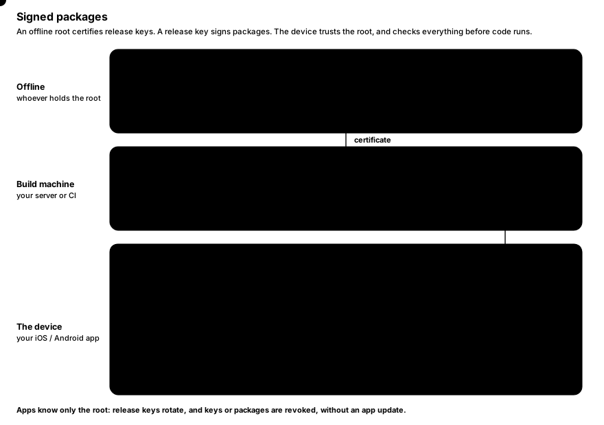
A signed package (`.nshpkg`) is how a host app runs nsh code it did not ship with: an update to its own nsh screens,
or a third-party mini app. `nsh publish` builds the app and signs it; the host app verifies the signature, the
certificate chain, revocations and the build number before anything runs.
> [!NOTE]
> nsh verifies and runs packages; it does not deliver them. Where packages come from (your update server, a CDN, a
> store of mini apps) and when the app downloads them is up to the host app.
## Why packages are signed
The JS a host app runs can reach everything the app [grants](https://native-shell.com/docs/sandbox-and-capabilities.md), so it must come from
someone the app trusts. There is a second reason: nsh ships apps as QuickJS bytecode, which loads faster than source,
but QuickJS does not validate bytecode, and crafted bytecode can corrupt memory. So nsh loads bytecode only from the
app's own (system-signed) resources, from the dev server the developer connected to, and from verified packages.
Anything else must be JS source.
## Keys: two levels
- A **root key** stays offline. Host apps trust its public key; they can trust several roots, which is how a root is
rotated.
- A root **certifies release keys**: a certificate names the release key, the app ids it may sign for and a time
window.
- **Packages are signed by a release key** and carry its certificate. Release keys can therefore be rotated (or
revoked) without updating the host apps, which only know the root.
Every key has an id derived from its public key (the first 8 bytes of its SHA-256, in hex), printed by every command.
### Create the keys
```sh
nsh keygen keys/root
nsh keygen keys/release
```
```text
key 4e0b637f5e10f6a6: keys/root.secret (keep it secret), keys/root.pub
key 3428d7136788c9ee: keys/release.secret (keep it secret), keys/release.pub
```
Each key is two files: `.secret` (readable by its owner only) and `.pub`, both one line of base64. `nsh
keygen` never overwrites an existing key.
> [!CAUTION]
> Keep `root.secret` offline, for example on an encrypted drive in a safe. Whoever has it can certify keys that every
> host app trusting the root accepts. Release keys belong on the build machine or in CI secrets.
### Certify a release key
```sh
nsh certify --root keys/root.secret --key keys/release.pub --apps 'com.example.*' -o keys/release.cert
```
```text
keys/release.cert: key 3428d7136788c9ee certified by root 4e0b637f5e10f6a6 for com.example.* until 365 days from now
```
| Flag | Description |
|---|---|
| `--root ` | The root's secret key. |
| `--key ` | The release key's public key. |
| `--apps ` | App ids it may sign for: `*` (any), `com.example.*` (ids under `com.example.`) or an exact id. Repeatable. |
| `--days ` | How long it may sign, from now. Default 365. |
| `-o, --out ` | The certificate to write. |
The certificate is a small JSON file; it is not secret.
## Publish a package
```sh
nsh publish App.tsx --key keys/release.secret --cert keys/release.cert
```
```text
out/com.example.counter-2.nshpkg: com.example.counter 1.0.0 (build 2), 0 assets, 12 KB, signed by 3428d7136788c9ee
```
`nsh publish` builds the app in release mode and signs it. The app id, name, version and build come from `nsh.json`
next to the entry, overridden by the flags:
| Flag | Description |
|---|---|
| `--key ` | The release key's secret key. |
| `--cert ` | Its certificate. |
| `-o, --out ` | The package to write. Default `out/-.nshpkg`. |
| `--id ` | App id, such as `com.example.app`. |
| `--app-version ` | Version, such as `1.2.0`. |
| `--build ` | Build number. Required (here or in `nsh.json`); it must grow with every release. |
`nsh publish` refuses to sign what a device would refuse: the certificate must cover the app id and the current time.
```text
Error: the release key's certificate does not cover this package: it does not cover app `com.example.counter` (only com.other.app)
```
### What a package holds
A package is one file: a JSON header (app id, name, version, build, the declared capabilities, the bytecode version,
the signing time, the release key's certificate and a table of files with their SHA-256), then the files, then the
release key's Ed25519 signature over everything before it. The files are:
- the app's JS source (always),
- its bytecode, used only when the device's runtime has the same bytecode version (otherwise the source runs, so a
package keeps working on newer runtimes),
- its source map,
- the assets it imports (images, fonts).
The package's identity, used for revocation, is the SHA-256 of the whole file.
## Verify a package
`nsh verify` checks a package exactly as a host app trusting the given roots would:
```sh
nsh verify out/com.example.counter-2.nshpkg --root keys/root.pub
```
```text
valid: com.example.counter 1.0.0 (build 2), release key 3428d7136788c9ee, sha256 f40565358c13fafce369792e41125fea7f93fe87dd1bc24fd575dabc09b34fd4, 0 assets, bytecode for this runtime
```
| Flag | Description |
|---|---|
| `--root ` | A trusted root's public key. Repeatable. Without any, only the package's own signature is checked. |
| `--revocations ` | A revocation list to apply first. |
A device checks, in order:
1. the certificate's signature by a trusted root;
2. that the release key is not revoked;
3. the package's signature by the release key;
4. that the certificate covers the app id and the signing time;
5. the minimum runtime the package needs;
6. that the file table covers the data exactly and each file matches its hash;
7. that the package itself is not revoked;
8. that its build is not older than the highest build of that app accepted before (rollback protection).
A refused package raises an error that says which check failed; the app that was running keeps running.
## Revoke keys and packages
A root signs **revocation lists**: release keys and packages that must not load any more.
```sh
# The first list.
nsh revoke --root keys/root.secret --sequence 1 \
--package f40565358c13fafce369792e41125fea7f93fe87dd1bc24fd575dabc09b34fd4 -o revocations.json
# Later: keep everything in the last list and add a release key (sequence becomes 2).
nsh revoke --root keys/root.secret --extend revocations.json --key 3428d7136788c9ee -o revocations-2.json
```
| Flag | Description |
|---|---|
| `--root ` | The root's secret key. |
| `--extend ` | Keep the entries of this list (the last one published). |
| `--sequence ` | The list's number, higher than any published before. With `--extend`, defaults to that list's plus one. |
| `--key ` | A release key id to revoke. Repeatable. |
| `--package ` | A package's SHA-256 (as `nsh verify` prints it) to revoke. Repeatable. |
| `-o, --out ` | The list to write. |
A trust store only accepts a list with a higher sequence number than the one it has, so an old list cannot be
replayed to un-revoke something. Publish the newest list where your apps fetch it, and apply it with
`updateRevocations` before opening packages.
## Rollback protection
When a host app accepts a package, its trust store records the build number for that app id and from then on refuses
older builds. An attacker who obtained an older, signed package with a known vulnerability cannot make the app run it.
The record persists in the store's state directory (`nsh-trust.json`), so it survives restarts.
## Loading packages in a host app
Verification hashes the whole package and extracts its assets (once per package, under the trust store's directory),
so it runs off the UI thread; running the result happens on it.
**iOS (Swift)**:
```swift
let trust = try NshTrust(stateDirectory: applicationSupport.appendingPathComponent("nsh"))
try trust.addRoot(rootPublicKey) // the contents of root.pub
try trust.updateRevocations(latestListJSON) // when you have one
let info = try await app.loadPackage(at: downloaded, trust: trust) // verify off the main thread, then run
```
**Android (Java)**:
```java
NshTrust trust = new NshTrust(new File(getFilesDir(), "nsh"));
trust.addRoot(rootPublicKey);
trust.updateRevocations(latestListJson);
NshPackage pkg = trust.openPackage(downloaded); // off the UI thread; throws NshPackage.RefusedException
runOnUiThread(() -> nsh.runPackage(pkg));
```
The package's declared [capabilities](https://native-shell.com/docs/sandbox-and-capabilities.md) travel with it: a package can do only what it
declares, and only what the host app grants on top.
Full API: [Embedding in iOS apps](https://native-shell.com/docs/embedding-ios.md#signed-packages),
[Embedding in Android apps](https://native-shell.com/docs/embedding-android.md#signed-packages).
## Trying a package in development
The development hosts that `nsh run` installs can run a package the way an embedding app would.
On iOS, the host executable takes `--package ` and one or more `--root `. After `nsh run` has
installed the host in the simulator (`--target ios`):
```sh
xcrun simctl launch booted com.longbridge.nsh.host \
--package "$PWD/out/com.example.counter-2.nshpkg" --root "$PWD/keys/root.pub"
```
On Android, the development host (`DevActivity`, installed by `nsh run --target android`) takes the extras `package`
(a path on the device) and `root` (base64 public keys, comma-separated):
```sh
adb push out/com.example.counter-2.nshpkg /sdcard/Android/data/com.longbridge.nsh.host/files/app.nshpkg
adb shell am start -S -n com.longbridge.nsh.host/com.longbridge.nsh.DevActivity \
--es package /sdcard/Android/data/com.longbridge.nsh.host/files/app.nshpkg \
--es root "$(cat keys/root.pub)"
```
Their trust state lives in the temporary (iOS) or cache (Android) directory, so builds older than one they accepted are
refused there too.
## A release checklist
1. Keep the root key offline; certify a release key per team or per app family, for a year or less.
2. Raise `build` in `nsh.json` for every release; `nsh publish` refuses a package without one.
3. Run `nsh verify --root root.pub` on the package before uploading it.
4. Ship `root.pub` inside the host app; ship revocation lists separately, so you can revoke without an app update.
5. If a release key leaks, revoke it (`nsh revoke --extend … --key `), certify a new one and publish again.
## See also
- [Sandbox and capabilities](https://native-shell.com/docs/sandbox-and-capabilities.md)
- [Embedding in iOS apps](https://native-shell.com/docs/embedding-ios.md), [Embedding in Android apps](https://native-shell.com/docs/embedding-android.md)
- [CLI](https://native-shell.com/docs/cli.md)
Source: https://native-shell.com/docs/signed-packages
---
# Sandbox and Capabilities
Every nsh app runs in its own QuickJS VM, and everything an app can do outside that VM goes through nsh's native
runtime. That makes it possible to run code you did not write, such as third-party mini apps or downloaded updates,
under rules the host app controls:
- **Limits** bound the memory, time and native resources one app can use.
- **Hardening** removes the ways to turn strings into code in release builds.
- **Capabilities** list what an app may reach: which hosts it may fetch from, which pages a web view may show, whether
it may change the status bar. The app declares them; a host app may grant less.
A bundle holds only the app's code: the reactive graph, the renderer and every module the app imports are native. So
nothing in JS is trusted, and every limit and check is enforced in Rust; there is no JS code an app could patch to get
around them.
## Limits
Each VM has these limits:
| Limit | Default | When it is hit |
|---|---|---|
| JS heap | 256 MB | The VM stops. |
| Interpreter stack | 4096 KB (also the maximum) | Deep recursion throws a `RangeError`, which the app can catch. |
| Time to evaluate the bundle | 10 s | The evaluation is cut off. |
| Time of any other call into JS | 2 s | The call is cut off; the app goes on. |
| Nodes kept | 200 000 | The VM stops. |
| Changes at once (queued operations) | 8 000 000 values | The VM stops. |
| Operations in one canvas drawing | 1 000 000 | The VM stops. |
**Time is budgeted per call, not per app.** A "call" is one thing the runtime asks JS to do: handle one event
(including the rendering it causes), bind one list row, run one timer, run one frame's `requestAnimationFrame`
callbacks, drain the microtask queue. A long-running app never accumulates time toward a limit; only a single call
that does not return in time is interrupted. Calls nested inside another share the outer call's budget.
An interrupted call ends with an exception that no `catch` can swallow, and the error is reported with the budget it
exceeded:
```text
the script was interrupted: a call into JS exceeded its budget of 2000 ms
```
The VM keeps running: the next event, timer or frame runs normally.
**Running out of memory or going over a quota stops the VM.** The error is reported once (to the host app's error
handler, and in development builds over the app), no JS runs after that, and the views stay as they were. The node
and operation quotas exist because native views and queued changes live in native memory, which the JS heap limit does
not cover: without them, an app could exhaust the device's memory through the UI.
> [!TIP]
> These limits are generous for normal apps. If you hit the 2 s call budget, the work is too long for one event
> anyway: it would freeze the app's updates for that long. Split it with `setTimeout`, or move it out of the event
> handler.
Host apps can change the limits per view: `NshAppView.limits` on [iOS](https://native-shell.com/docs/embedding-ios.md#limits),
`NshView.setLimits` on [Android](https://native-shell.com/docs/embedding-android.md#limits). They apply from the next load.
## Hardening
Release builds (everything not loaded from a dev server) are hardened when they load:
- `eval` is removed, and the `Function`, `AsyncFunction`, `GeneratorFunction` and `AsyncGeneratorFunction`
constructors throw. nsh runs no code made from strings:
```text
TypeError: the Function constructor is disabled: nsh runs no code from strings (development builds allow it)
```
- The prototypes all modules share (`Object`, `Array`, `Function`, `String`, `Number`, `Promise`, `Map`, typed arrays
and the rest) are frozen, so one module (or one library) cannot change `Array.prototype` for everyone else.
`Error.prototype` stays writable, so error subclasses can set `this.name`.
Freezing prototypes would normally break a common pattern, the "override mistake": assigning
`Sub.prototype.constructor = Sub` or `obj.toString = …` throws when the inherited property is frozen. nsh turns the
commonly overridden members (`constructor`, `toString`, `valueOf`, `toJSON`, ...) into accessors whose setter defines
the property on the object assigned to, so such code (and libraries like axios that use it) keeps working.
Bundles served by `nsh dev` / `nsh run` (with or without `--release`) are not hardened, so you can debug with `eval`. Test the release
behavior with `nsh trace` (which hardens) or a packaged build before shipping code that relies on dynamic code.
## Capabilities
An app declares what it may reach outside its VM in `nsh.json`:
```json
{
"name": "Quotes",
"id": "com.example.quotes",
"version": "1.0.0",
"build": 3,
"capabilities": {
"network": {
"hosts": ["api.example.com", "*.cdn.example.com"],
"http": [{ "host": "quotes.example.com", "methods": ["GET"], "pathPrefix": "/v1/" }]
},
"webview": { "hosts": ["*.example.com"] },
"statusBar": true
}
}
```
**An app without `"capabilities"` may do everything**: a standalone app is its developer's own, and nothing is
restricted. **An app with `"capabilities"` may do only what it lists**: everything else is denied. Unknown keys are
build errors, so a typo is caught when you build instead of becoming a missing permission at runtime.
### `network`
Covers `fetch` (including every redirect), remote images (``, `defaultSource`, canvas images,
`Image.getSize` / `Image.prefetch`) and video sources.
| Key | Type | Description |
|---|---|---|
| `hosts` | `string[]` | Hosts the app may reach with any method and scheme (`http`, `https`, `ws`, `wss`). |
| `http` | `object[]` | Finer grants, one per host. |
| `http[].host` | `string` | The host (required). |
| `http[].methods` | `string[]` | Allowed methods, such as `["GET", "HEAD"]`. Empty or missing: any. |
| `http[].schemes` | `string[]` | Allowed schemes. Empty or missing: any of `http`, `https`, `ws`, `wss`. |
| `http[].pathPrefix` | `string` | The URL's path must start with it. |
Host patterns are `*` (any host), `*.example.com` (any subdomain of `example.com`, not `example.com` itself) or an
exact host name. Matching ignores case and the port. The host is taken after the last `@`, so
`https://api.example.com@evil.io/` is checked as `evil.io`.
`asset:` URIs (the app's own files) are always allowed; images and videos may also use `data:` URIs and relative
paths.
### `webview`
| Key | Type | Description |
|---|---|---|
| `hosts` | `string[]` | Hosts a [web view](https://native-shell.com/docs/web-view-and-video.md) may show and navigate to (`http` and `https`). Without `webview`, the app may not show web pages at all. |
Top-level navigations inside the web view are checked too, by the platform's navigation delegate, before they load.
The page's own subresources (its scripts, images, XHRs) are the web content's business and are not checked.
`about:blank` and inline HTML (`source={{ html }}`) need only web views to be granted at all: `"webview": { "hosts": [] }`
allows them without allowing any remote page.
### `statusBar`
`"statusBar": true` lets the app change the status bar (the `StatusBar` component and its functions in
[`nsh/ui/mobile`](https://native-shell.com/components/status-bar.md)).
### What a refusal looks like
| Request | Result |
|---|---|
| `fetch` | The promise rejects; the request never reaches the network. |
| Remote image | The image fails with `onError`. |
| Video source, web view source, status bar change | Nothing is shown or changed. |
Each refusal is logged once, saying which key to add:
```text
fetch GET https://evil.example.org/x is not granted: add `evil.example.org` to capabilities.network in nsh.json
```
Redirects are followed by nsh, not by the platform's HTTP stack, so every hop is checked against the capabilities. (A
streamed request body is not sent twice, so a `307` / `308` redirect of a streamed upload fails.)
### Where capabilities travel
The declaration goes with the app wherever it goes:
- `nsh build` and `nsh package` write it next to the bundle as `capabilities.json`;
- `nsh publish` puts it in the [signed package](https://native-shell.com/docs/signed-packages.md) header, covered by the signature;
- `nsh dev` sends it with every build, so development enforces the same rules. Changing `capabilities` reloads the app
instead of hot-patching it.
## Grants: what a host app allows
A host app that embeds nsh can grant **at most** some capabilities, in the same JSON form:
```swift
// iOS
try app.grantCapabilities(#"{ "network": { "hosts": ["api.example.com"] } }"#)
```
```java
// Android
nsh.setGrantedCapabilities("{ \"network\": { \"hosts\": [\"api.example.com\"] } }");
```
A request must be allowed by **both** the app's declaration and the host's grant. With the grant above, an app that
declares `"hosts": ["*"]` can still only reach `api.example.com`, and cannot show web pages or change the status bar.
Without a grant (`nil` / `null`, the default), what each app declares applies.
Grants apply from the next load. A typical setup for third-party mini apps: grant each one only its own API host, run
it from a [signed package](https://native-shell.com/docs/signed-packages.md) whose declaration you reviewed, and keep the default limits or lower
them.
> [!WARNING]
> [Native components](https://native-shell.com/docs/native-components.md) the host app registers are the host's own code: capabilities do not
> apply to them. Register only components that are safe for every app the view may run.
## Summary
| Layer | Enforced by | Set by |
|---|---|---|
| Limits (heap, stack, time, nodes) | the runtime, per VM | defaults; host app per view |
| Hardening | the runtime, on load | always on outside development |
| Capabilities | the runtime (fetch, images, video, web views, status bar) | the app (`nsh.json`) and the host app (grant) |
| Code integrity | signature verification | `nsh publish`; the host app's trusted roots |
## See also
- [Signed packages](https://native-shell.com/docs/signed-packages.md)
- [Networking](https://native-shell.com/docs/networking.md)
- [Embedding in iOS apps](https://native-shell.com/docs/embedding-ios.md), [Embedding in Android apps](https://native-shell.com/docs/embedding-android.md)
Source: https://native-shell.com/docs/sandbox-and-capabilities
---
# Project structure
An nsh app is a directory with an entry module and an optional `nsh.json`. Everything else (more modules, images, fonts, JSON files) is found by following the entry's imports, so there is no file list to maintain.
```text
my-app/
├── App.tsx the entry module: calls mount()
├── nsh.json name, id, version, icon, Tailwind theme, capabilities
├── tsconfig.json TypeScript settings for editors
├── .gitignore .nsh/ and out/
├── components/ your own modules (any layout you like)
│ └── Header.tsx
├── assets/
│ ├── logo@2x.png imported images
│ └── Inter.ttf imported fonts
├── .nsh/ generated: type declarations, development host builds
└── out/ generated: nsh build / nsh package output
```
Every command takes the entry as its argument (`nsh run my-app/App.tsx`). The directory that contains the entry is the app's root: `nsh.json` is read from there, asset paths are relative to it, and `.nsh/` is written there.
## The entry module
The entry is a normal module that ends by rendering the root component:
```tsx
import { mount } from "nsh";
import { Home } from "./components/Home";
function App() {
return ;
}
mount(App);
```
`mount(component, props?)` renders the component into the app's surface and returns a function that removes it again. An app calls it once. Code at the top level of the entry runs when the bundle loads, before the first frame.
## nsh.json
`nsh.json` sits next to the entry. Every key is optional; `nsh init` writes the first four.
```json
{
"name": "Gallery",
"id": "com.example.gallery",
"version": "1.0.0",
"build": 1,
"icon": "icon.png",
"tailwind": {
"colors": { "brand": { "500": "#7c3aed", "600": "#6d28d9" } },
"radius": { "card": 14 }
},
"capabilities": {
"network": { "hosts": ["api.example.com", "*.cdn.example.com"] }
}
}
```
| Key | Type | Used by | Description |
|---|---|---|---|
| `name` | string | `package` | The display name under the app icon. Default: the entry directory's name. |
| `id` | string | `package`, `publish` | Bundle identifier / application id, e.g. `com.example.app`. Default: `com.example.`. |
| `version` | string | `package`, `publish` | The user-visible version, e.g. `1.2.0` (`CFBundleShortVersionString`, Android `versionName`). |
| `build` | number | `package`, `publish` | The build number (`CFBundleVersion`, Android `versionCode`). Signed packages require it to grow with every release. |
| `icon` | string | `package` | A square PNG, ideally 1024×1024, relative to `nsh.json`. |
| `tailwind` | object | every build | Extends the Tailwind theme your `class` strings resolve against ([Tailwind](https://native-shell.com/docs/tailwind.md#theme)). |
| `theme` | string or object | every build | The theme of the `nsh/ui/mobile` components: a theme file's path relative to `nsh.json`, or the theme inline ([Components](https://native-shell.com/components.md)). |
| `capabilities` | object | every build | What the app may reach outside its VM: network hosts, web view hosts, the status bar ([Sandbox and capabilities](https://native-shell.com/docs/sandbox-and-capabilities.md)). |
The flags of `nsh package` and `nsh publish` (`--name`, `--id`, `--app-version`, `--build`, `--icon`) override the file's values ([CLI](https://native-shell.com/docs/cli.md)).
`tailwind`, `theme` and `capabilities` are checked when the app is built. A typo is a build error rather than a setting that silently does nothing:
```text
Error: nsh.json: tailwind: unknown theme key `colours`
Error: nsh.json: capabilities: unknown key `net` (known: network, webview, statusBar)
```
> [!WARNING]
> `nsh package` and `nsh publish` read `nsh.json` strictly and currently reject keys they do not know, including `theme`. If you set a component theme, package from a copy of the app without it until this is fixed.
### capabilities
Without a `capabilities` key, an app may use the network, web views and the status bar freely: a standalone app is its developer's own. With the key, everything not listed is denied, both in development and in packaged apps:
```json
"capabilities": {
"network": {
"hosts": ["api.example.com", "*.cdn.example.com"],
"http": [{ "host": "quotes.example.com", "methods": ["GET"], "pathPrefix": "/v1/" }]
},
"webview": { "hosts": ["*.example.com"] },
"statusBar": true
}
```
`network` covers `fetch`, remote images and video sources; local assets are always allowed. An app that embeds nsh may grant less than an app declares. The details are in [Sandbox and capabilities](https://native-shell.com/docs/sandbox-and-capabilities.md).
## tsconfig.json and .nsh/types
nsh does not need `node_modules`. Instead, every command that builds the app (`init`, `build`, `trace`, `dev`, `run`, `package`, `publish`) writes the TypeScript declarations of everything nsh provides into `.nsh/types`, and `tsconfig.json` points the `nsh` imports there:
```json
{
"compilerOptions": {
"target": "ES2023",
"lib": ["ES2023"],
"module": "ESNext",
"moduleResolution": "Bundler",
"jsx": "preserve",
"jsxImportSource": "nsh",
"strict": true,
"noEmit": true,
"isolatedModules": true,
"skipLibCheck": true,
"types": [],
"paths": {
"nsh": ["./.nsh/types/nsh/index.d.ts"],
"nsh/*": ["./.nsh/types/nsh/*.d.ts"]
}
},
"include": ["**/*.ts", "**/*.tsx", ".nsh/types/nsh/globals.d.ts", ".nsh/types/nsh/assets.d.ts"]
}
```
| File in `.nsh/types/nsh/` | Declares |
|---|---|
| `index.d.ts` | `nsh`: `signal`, `computed`, `effect`, `mount`, `View`, `Text`, ... and re-exports the types below |
| `types.d.ts` | Styles (`ViewStyle`, `TextStyle`, ...), every element's props and events, `YNode` (what a `ref` receives) |
| `jsx-runtime.d.ts` | The JSX runtime TypeScript resolves through `jsxImportSource` (the `JSX` namespace) |
| `globals.d.ts` | `If` and `Each`; `console`, timers, `requestAnimationFrame`, `fetch` and the other [web APIs](https://native-shell.com/modules/web-apis.md) |
| `assets.d.ts` | What importing an image or font gives |
| `list.d.ts`, `animated.d.ts`, `device.d.ts`, ... | One file per module (`nsh/list`, `nsh/animated`, `nsh/device`, ...) |
| `ui/mobile.d.ts` | `nsh/ui/mobile` |
`lib` is `ES2023` without `DOM`: there is no `document` or `window`. The files are regenerated (only when their contents change), so do not edit them and do not commit them; `.gitignore` already excludes `.nsh/`. If your editor shows `nsh` as missing after cloning a project, run any build command once, e.g. `nsh trace App.tsx`.
`jsxImportSource: "nsh"` and `jsx: "preserve"` only matter to the editor: nsh compiles JSX with its own compiler, whatever the `tsconfig.json` says. TypeScript is checked by your editor (or `tsc` if you have it); `nsh` strips types without checking them.
## Modules
Split the app into as many `.ts` and `.tsx` modules as you like and import them with relative paths; the extension may be left out:
```tsx
import { Header } from "./components/Header";
import { formatPrice } from "./lib/format";
import strings from "./strings.json";
```
All of them are bundled into one script. JSON files import as their parsed value.
### nsh's modules
Imports of `nsh` and `nsh/...` are not bundled: the runtime provides them natively.
| Module | What it has |
|---|---|
| `nsh` | Reactivity (`signal`, `computed`, `effect`, ...), `mount`, `split`, `context`; `View`, `Text`, `Scroll`, `Input` ([reference](https://native-shell.com/modules/nsh.md)) |
| `nsh/ui/mobile` | The mobile UI set: components, navigation, alerts, safe area ([Components](https://native-shell.com/components.md)) |
| `nsh/list` | `List`: virtualized, recycling lists |
| `nsh/animated` | Native animations |
| `nsh/canvas` | 2D drawing |
| `nsh/gesture` | `PanResponder` |
| `nsh/device` | `Platform`, `windowSize`, `colorScheme`, `fontScale`, `PixelRatio`, `I18nManager` |
| `nsh/accessibility` | Screen reader and reduce motion state, announcements |
| `nsh/image` | `Image` (the element), `Image.getSize`, `Image.prefetch` |
| `nsh/webview`, `nsh/video` | `WebView`, `Video` |
| `nsh/native` | Components the embedding app registers |
| `nsh/ios`, `nsh/android` | Platform-only APIs |
The [modules reference](https://native-shell.com/modules.md) documents each one. Importing a module nsh does not have (`nsh/foo`) is a build error.
### npm packages
nsh needs nothing from npm, but the bundler resolves bare imports from a `node_modules` directory if you install packages with a package manager. Packages resolve their browser builds, because the runtime provides web APIs (`fetch`, streams, `URL`, `TextEncoder`, ...) and not Node's (`fs`, `Buffer`, `process`). Packages that touch the DOM do not work: there is none.
`solid-js` cannot be imported: the bundler refuses it and points to `nsh`'s own `signal`, `computed` and `effect`, which replace it.
## Assets
Images and fonts are imported like modules. The bundler records each imported file and ships it with the app: `nsh build` copies them to `out/assets/`, `nsh package` puts them in the app, and during development the dev server serves them.
```tsx
import { Text } from "nsh";
import { Image } from "nsh/image";
import logo from "./assets/logo@2x.png"; // { uri: "asset:/assets/logo@2x.png", width: 64, height: 64 }
import Inter from "./assets/Inter.ttf"; // "Inter"
Hello
```
| Extension | Import gives |
|---|---|
| `.png`, `.jpg`, `.jpeg`, `.gif`, `.webp`, `.heic` | An `ImageAsset`: `{ uri, width, height }`, sized in points. An `@2x` / `@3x` suffix divides the pixel size by 2 / 3. |
| `.ttf`, `.otf` | The font's family name, a string. The font is registered before the first frame. |
| `.json` | The parsed JSON |
See [Images and assets](https://native-shell.com/docs/images-and-assets.md) and [Fonts](https://native-shell.com/docs/fonts.md).
## Generated directories
- **`.nsh/`**: the type declarations (`.nsh/types`) and what `nsh run` installs on simulators and devices (the Catalyst host app, the Android development APK). Safe to delete; it is recreated.
- **`out/`**: the default output of `nsh build` (`bundle.js`, `bundle.js.map`, `bundle.qbc`, `capabilities.json`, `assets/`) and `nsh package` (`.app`, `.ipa`, `.apk`). Change it with `-o`.
Source: https://native-shell.com/docs/project-structure
---
# CLI
`nsh` is the only tool an nsh app needs. Every subcommand that builds an app takes `[ENTRY]`: the entry module, or the app's directory, whose `App.tsx` is the entry (default: the current directory, so `cd my-app && nsh run` works). It reads `nsh.json` next to the entry and refreshes the type declarations in `.nsh/types`.
```text
nsh
init Create an app
build Bundle an app and compile it to QuickJS bytecode
trace Run an app headless and print the mount instructions and timings
dev Serve an app to dev hosts (simulators, devices) and push rebuilds
run Like dev, and also run the app in a development host
package Package an installable app from the prebuilt runtime
keygen Create a signing key
certify Certify a release key with a root key
publish Build an app in release mode and sign it into a package (.nshpkg)
verify Verify a package
revoke Sign a revocation list
```
`nsh --help` prints the flags of a command; `nsh --version` prints the version.
## nsh init
```sh
nsh init [DIR] [--name ]
```
Creates an app in `DIR` (default: the current directory, created if missing): `App.tsx`, `nsh.json`, `tsconfig.json`, `.gitignore` and `.nsh/types`. Files that exist are kept; it fails only if all of them exist already.
| Flag | Description |
|---|---|
| `--name ` | Display name written to `nsh.json`. Default: the directory's name. The id becomes `com.example.` (letters and digits only, lower case). |
## nsh run
```sh
nsh run [ENTRY] [--target catalyst|ios|android] [--device ] [--port ] [--release] [--trace]
```
Starts the dev server (as `nsh dev`), launches a development host that loads the app from it, and rebuilds on every save. Hot module replacement patches the running app in place; logs and errors from the app are printed in the terminal. Stop it with Ctrl-C (or by closing the Catalyst window).
| Flag | Default | Description |
|---|---|---|
| `--target ` | `catalyst` | `catalyst`: the Mac Catalyst host, an iPhone-sized window (390×844). `ios`: the host in an iOS simulator. `android`: the host on an Android device or emulator. |
| `--device ` | | iOS simulator to use, by name (`"iPhone 16 Pro"`) or UDID. Default: a booted one, else the newest iPhone, which is booted. |
| `--port ` | `8790` | Dev server port. If it is taken, the next free one is used. |
| `--release` | | Minify and strip debug info. Release bundles have no hot module replacement: every save reloads the app. |
| `--trace` | | The host logs the timing of every commit (JS, layout, mount items) to the terminal. |
With `--target android`, the first device `adb devices` lists is used; the dev server's port is forwarded to it with `adb reverse`. See [Getting started](https://native-shell.com/docs/getting-started.md#run-it) and [Dev server and debugging](https://native-shell.com/docs/dev-server-and-debugging.md).
## nsh dev
```sh
nsh dev [ENTRY] [--port ] [--release]
```
Runs only the dev server: it builds the app, watches the entry's directory, and pushes every rebuild to the hosts connected to it. It prints the URL for hosts on this machine and one per LAN address for devices:
```text
info dev server: ws://127.0.0.1:8790/ws
info devices on this network: ws://192.168.1.20:8790/ws
```
Use it with hosts you start yourself, for example an app that embeds the development SDK (`NativeShellDev.xcframework`, `nsh-dev.aar`). Flags as for `nsh run`.
## nsh trace
```sh
nsh trace [ENTRY] [--taps ] [--idle-ms ] [--scroll ] [--width ] [--height ]
```
Runs the app headless, in the CLI's own process with the same core and runtime as a device but no views, and prints every mount instruction (create, insert, style, frame, text) and the time of each commit. Then it taps the first pressable view and prints what each tap changed. Use it to check that an app starts without errors, to count the work an interaction causes, and in CI ([Testing and trace](https://native-shell.com/docs/testing-and-trace.md)).
```text
bundled in 12.6 ms (3255 B)
info nsh::perf commit: 56 ops, 412µs (list js 6µs), 49 mount items, 21 nodes
── initial render: 49 items
Create { id: 2, kind: View }
...
── tap #1 on view 20: 3 items
Text { id: 14, text: "1", content: 71x77 @ 0,0 }
```
| Flag | Default | Description |
|---|---|---|
| `--taps ` | `2` | Taps sent to the first pressable view. A tap that changes nothing is an error (exit code 1). |
| `--idle-ms ` | `1200` | Idle time before tapping. The default lets the engine's idle garbage collection run first, so retention bugs show up. |
| `--scroll ` | | Scrolls the first scroll view or list by this many points, 10 points per frame, and prints each frame's batch. |
| `--width ` | `390` | Viewport width in points. |
| `--height ` | `844` | Viewport height in points. |
`nsh trace` behaves as iOS: `Platform.OS` is `"ios"`, and `ios:` classes and `ios={{…}}` props apply.
## nsh build
```sh
nsh build [ENTRY] [-o ] [--release]
```
Bundles the app and compiles it to QuickJS bytecode, for apps that embed nsh and ship the bundle themselves.
| Flag | Default | Description |
|---|---|---|
| `-o, --out ` | `out` | Output directory. |
| `--release` | | Minify and strip debug info. |
It writes:
| File | Content |
|---|---|
| `bundle.js` | The bundle as JavaScript |
| `bundle.js.map` | Its source map (stack traces are mapped back to your sources) |
| `bundle.qbc` | The bundle as QuickJS bytecode: what apps load |
| `capabilities.json` | The `capabilities` of `nsh.json`, if declared (removed otherwise) |
| `assets/` | Every imported image and font, at its path relative to the app root |
## nsh package
```sh
nsh package [ENTRY] --target ios|ios-simulator|android [-o ] [flags]
```
Builds an installable app from the prebuilt runtime, in release mode. No Rust and no Xcode project or Gradle build are involved: nsh assembles the app bundle itself and uses Xcode's `actool` and `codesign` (iOS) or the SDK's `aapt2`, `zipalign` and `apksigner` (Android). Metadata comes from `nsh.json`, overridden by the flags.
| Flag | Description |
|---|---|
| `--target ` | Required. `ios`: iOS devices, a signed `.ipa` (or an unsigned `.app` without `--sign`). `ios-simulator`: an ad hoc signed `.app`. `android`: a signed `.apk`. |
| `-o, --out ` | Output directory (default `out`). |
| `--name ` | Display name. |
| `--id ` | Bundle identifier, e.g. `com.example.app`. |
| `--app-version ` | Version, e.g. `1.2.0`. |
| `--build ` | Build number. |
| `--icon ` | App icon: a square PNG, ideally 1024×1024. |
| `--sign ` | iOS devices: code signing identity, e.g. `"Apple Development: …"`. |
| `--profile ` | iOS devices: provisioning profile (`.mobileprovision`). Entitlements come from it. |
| `--keystore ` | Android: release keystore. Default: the debug key in `~/.android/debug.keystore` (created if missing). |
| `--key-alias ` | Android: key alias in the keystore. |
| `--keystore-password ` | Android: keystore password. Also read from `NSH_KEYSTORE_PASSWORD`. |
| `--run` | Install and launch the app afterwards: in the simulator (`ios-simulator`) or on the connected Android device. |
```sh
nsh package App.tsx --target ios-simulator --run
nsh package App.tsx --target ios --sign "Apple Development: Jane Doe (ABCDE12345)" --profile dev.mobileprovision
nsh package App.tsx --target android --keystore release.jks --key-alias upload
```
See [Packaging](https://native-shell.com/docs/packaging.md).
## Signing commands
These commands make and check signed packages (`.nshpkg`): app bundles that apps embedding nsh download and verify before running them. [Signed packages](https://native-shell.com/docs/signed-packages.md) explains the model (an offline root key certifies release keys for some app ids).
### nsh keygen
```sh
nsh keygen
```
Creates an Ed25519 key pair: `.secret` and `.pub` (e.g. `nsh keygen keys/root`). Keep a root's `.secret` offline; apps trust its `.pub`.
### nsh certify
```sh
nsh certify --root --key --apps ... [--days ] -o
```
Certifies a release key with a root key for some app ids and a time window; packages carry the certificate.
| Flag | Description |
|---|---|
| `--root ` | The root's secret key. |
| `--key ` | The release key's public key. |
| `--apps ` | App ids it may sign for: `*`, `com.example.*` or an id. Repeatable. |
| `--days ` | How long it may sign, from now (default 365). |
| `-o, --out ` | The certificate to write. |
### nsh publish
```sh
nsh publish [ENTRY] --key --cert [-o ] [--id ] [--app-version ] [--build ]
```
Builds the app in release mode and signs it into a package. Metadata comes from `nsh.json`, overridden by the flags.
| Flag | Description |
|---|---|
| `--key ` | The release key's secret key. |
| `--cert ` | Its certificate (`nsh certify`). |
| `-o, --out ` | The package to write. Default: `out/-.nshpkg`. |
| `--id ` | App id. |
| `--app-version ` | Version. |
| `--build ` | Build number: must grow with every release. |
### nsh verify
```sh
nsh verify [--root ]... [--revocations ]
```
Verifies a package as an app trusting the given roots would. Without `--root`, only the package's own signature is checked. It prints the package's SHA-256, which `nsh revoke --package` takes.
### nsh revoke
```sh
nsh revoke --root [--extend ] [--sequence ] [--key ]... [--package ]... -o
```
Signs a revocation list: release keys and packages that must not load any more.
| Flag | Description |
|---|---|
| `--root ` | The root's secret key. |
| `--extend ` | Keep the entries of this list (the last one published). |
| `--sequence ` | The list's number, higher than any published before. Default with `--extend`: that list's plus one. |
| `--key ` | A release key id to revoke. Repeatable. |
| `--package ` | A package SHA-256 to revoke. Repeatable. |
| `-o, --out ` | The list to write. |
## Environment variables
| Variable | Used by | Description |
|---|---|---|
| `ANDROID_HOME`, `ANDROID_SDK_ROOT` | Android targets | The Android SDK. Fallback: `~/Library/Android/sdk`. |
| `NSH_KEYSTORE_PASSWORD` | `package --target android` | The keystore password. |
| `NSH_RUNTIME` | `run`, `package` | A runtime directory to use instead of the one next to the CLI. |
Source: https://native-shell.com/docs/cli
---
# JSX and components
nsh apps describe their UI with JSX, but there is no React and no virtual DOM. nsh's compiler turns each JSX element into direct calls of the native renderer, and a component is a plain function that runs once to build its part of the tree. What keeps the UI up to date afterwards is [reactivity](https://native-shell.com/docs/reactivity.md): expressions in JSX that read signals are followed natively, and only they run again.
## Elements
Every tag is PascalCase and names something in scope. The **host elements**, each backed by a native view, are components you import from nsh's modules; only `If` and `Each` are globals that need no import:
| Tag | Import from | Native view | Page |
|---|---|---|---|
| `` | `nsh` | `UIView` / `ViewGroup`: a box for layout, styling and touches | [View](https://native-shell.com/elements/view.md) |
| `` | `nsh` | A native text view; nested `` elements are spans | [Text](https://native-shell.com/elements/text.md) |
| `` | `nsh/image` | An image view (local assets and URLs) | [Image](https://native-shell.com/elements/image.md) |
| `` | `nsh` | `UIScrollView` / `ScrollView` | [Scroll](https://native-shell.com/elements/scroll.md) |
| `` | `nsh` | `UITextField` / `UITextView` / `EditText` | [Input](https://native-shell.com/elements/input.md) |
| `` | `nsh/list` | A virtualized, recycling list | [List](https://native-shell.com/elements/list.md) |
| `
```
Because a cell may show a header now and a name later, the row decides what to render with [``](https://native-shell.com/elements/control-flow.md), which switches when the item changes. Sticky headers need one column and a list that is not inverted.
## Chat: inverted lists
`inverted` lays the list out from the end: item 0 is at the bottom, the list starts scrolled to the end, and it keeps its distance from the end as items change. Keep the newest message first in the array; prepend to add one, append to load older ones with `onEndReached` (the "end" of an inverted list is the top).
```tsx
import { Input, mount, signal, Text, View } from "nsh";
import { List } from "nsh/list";
import { KeyboardAvoidingView } from "nsh/ui/mobile";
type Message = { id: number; text: string; mine: boolean };
function Chat() {
let next = 0;
const message = (text: string, mine: boolean): Message => ({ id: next++, text, mine });
const messages = signal(Array.from({ length: 30 }, (_, i) => message(`Message ${30 - i}`, i % 3 === 0)));
const draft = signal("");
const send = () => {
if (!draft().trim()) return;
messages.update((m) => [message(draft(), true), ...m]); // newest first
draft.set("");
};
const loadOlder = () => messages.update((m) => [...m, ...Array.from({ length: 20 }, (_, i) => message(`Older ${i}`, false))]);
return (
{(m) => (
{m().text}
)}
draft.set(t)}
onSubmitEditing={send}
blurOnSubmit={false}
returnKeyType="send"
placeholder="Message"
style={{ flex: 1, borderWidth: 1, borderColor: "#d0d7de", borderRadius: 18, paddingHorizontal: 12, paddingVertical: 8 }}
/>
);
}
mount(Chat);
```
`scrollToEnd()` on an inverted list scrolls to its start: the newest message.
## Horizontal lists
`horizontal` turns the list sideways; cells are laid out at the list's height. Combined with snapping it makes a carousel of any length:
```tsx
{(card) => }
```
Right to left, horizontal lists start at the right and run leftwards.
## Loading more: onEndReached
`onEndReached` fires when the viewport comes within `onEndReachedThreshold` viewports of the end (1 by default: one screen ahead). Append the next page; the list fires again when the new end comes near.
```tsx
const posts = signal([]);
let loading = false;
let page = 0;
const loadMore = async () => {
if (loading) return;
loading = true;
try {
const next: Post[] = await (await fetch(`https://api.example.com/posts?page=${++page}`)).json();
posts.set([...posts(), ...next]);
} finally {
loading = false;
}
};
loadMore();
Loading…}
>
{(post) => }
```
Guard against overlapping loads as above: the end may be reported again while a page is on its way.
## Viewability
`onViewableItemsChanged` reports which items are on screen, for analytics, autoplaying the visible video, or marking messages read. It gets `{ viewableItems, changed }`, arrays of tokens `{ item, key, index, isViewable }`. Viewability is computed natively; JS only hears about changes.
| `viewabilityConfig` | Description |
|---|---|
| `itemVisiblePercentThreshold` | Percent of an item that must be visible. |
| `viewAreaCoveragePercentThreshold` | Percent of the viewport an item must cover. |
| `minimumViewTime` | Milliseconds an item must stay viewable before it is reported. |
Without a threshold, any visible pixel counts.
```tsx
v.slug}
viewabilityConfig={{ itemVisiblePercentThreshold: 60, minimumViewTime: 250 }}
onViewableItemsChanged={({ viewableItems }) => playing.set(viewableItems[0]?.key ?? null)}
>
{(v) => }
```
## Scrolling from code
Give the list a `ref`:
| Method | Description |
|---|---|
| `scrollToIndex({ index, animated?, viewPosition?, viewOffset? })` | Scrolls item `index` into view. `viewPosition` places it: 0 at the start of the viewport (default), 0.5 in the middle, 1 at the end; `viewOffset` shifts it further. |
| `scrollToOffset({ offset, animated? })` | Scrolls to a content offset along the list's axis. |
| `scrollToEnd({ animated? })` | Scrolls to the end of the content (the start of an inverted list). |
| `scrollTo({ x?, y?, animated? })` | Scrolls to an offset, as on ``. |
```tsx
import { type YNode } from "nsh";
import { List } from "nsh/list";
let list!: YNode;
…
list.scrollToIndex({ index: 120, viewPosition: 0.5 });
```
`scrollToIndex` is resolved natively with the sizes known at that moment: measured rows where they have been measured, `estimatedItemSize` elsewhere. Jumping far into a list of rows that vary a lot in height may land a little off; a good estimate keeps that small. To open a list at an item, use `initialScrollIndex` rather than scrolling after the first frame.
## ListView from nsh/ui/mobile
`ListView` from `nsh/ui/mobile` is a ready-made list built on the same machinery: you pass `each` and render a row, and it adds the padding, dividers and an `inset` grouped look. Use it for settings-style and plain lists that should look like the rest of the mobile UI set; use `List` when you control the whole look. See [ListView](https://native-shell.com/components/list-view.md).
```tsx
import { Text } from "nsh";
import { ListView } from "nsh/ui/mobile";
s.id}>
{(s) => {s().label}}
```
## Performance notes
- Each cell is laid out on its own, so scrolling only lays out the cells that changed. Keep rows shallow and avoid reading signals in rows that change on every frame.
- The native side asks for cells in batches, up to several rounds per frame, merged into one update; a fast fling binds many cells in one frame without a JS call per cell.
- Use [`nsh trace --scroll`](https://native-shell.com/docs/testing-and-trace.md) to measure the per-frame cost of your rows.
## Related
- [`List` element](https://native-shell.com/elements/list.md) and [`nsh/list`](https://native-shell.com/modules/nsh-list.md): the reference.
- [Scrolling](https://native-shell.com/docs/scrolling.md): the scrolling props lists share with ``.
- [Reactivity](https://native-shell.com/docs/reactivity.md): why `item()` is a function.
- [Performance](https://native-shell.com/docs/performance.md): measuring lists.
Source: https://native-shell.com/docs/lists
---
# Navigation
`nsh/ui/mobile` provides a native navigation stack and native modals. A `Stack` is a UINavigationController on iOS, with its header, swipe back and large titles, and a stack with a toolbar and predictive back on Android. You keep the list of routes in a navigator; the stack renders each route as a screen and keeps it mounted, with its state, while it is in the stack.
```tsx
import { mount, Scroll, Text, View } from "nsh";
import { createNavigator, Screen, Stack } from "nsh/ui/mobile";
type Route = { name: "inbox" } | { name: "message"; id: number };
const nav = createNavigator({ name: "inbox" });
function Inbox() {
return (
{(id) => (
nav.push({ name: "message", id: id() })} underlayColor="#eaeef2" style={{ padding: 16 }}>
Message {id()}
)}
);
}
function Message(props: { id: number }) {
return (
The body of message {props.id}.
);
}
function App() {
return (
{(route) => {
switch (route.name) {
case "inbox":
return ;
case "message":
return ;
}
}}
);
}
mount(App);
```
## The navigator
`createNavigator(initial)` creates the stack of routes. A route is any value you like (a string, an object, a discriminated union as above); routes are compared by identity, so push a new object for each screen. Create the navigator once, at module level or in your root component, and import it wherever screens navigate.
| Member | Description |
|---|---|
| `routes()` | The routes, bottom to top (reactive). |
| `push(route)` | Pushes a screen. |
| `pop(count?)` | Pops `count` screens (default 1); at least one stays. |
| `popToTop()` | Pops back to the first screen. |
| `replace(route)` | Replaces the top screen. |
| `reset(routes)` | Replaces all screens, e.g. after signing in. |
| `remove(route)` | Removes a route wherever it is. |
`createNavigator` also takes an array, to start several screens deep: `createNavigator([{ name: "inbox" }, { name: "message", id: 3 }])`.
When the user leaves a screen natively (the back button in the header, a swipe back on iOS, Android's back button or gesture), the stack removes that route from the navigator for you, so `routes()` always matches what is on screen.
A route carries what the screen needs. The gallery app pushes routes that hold the screen component itself, which keeps the route type small when there are many screens:
```ts
import { type JSX } from "nsh";
import { createNavigator } from "nsh/ui/mobile";
export type Route = { name: "home" } | { name: "page"; page: () => JSX.Element };
export const nav = createNavigator({ name: "home" });
// Elsewhere: nav.push({ name: "page", page: Settings });
```
## Stack
| Prop | Type | Description |
|---|---|---|
| `navigator` | `Navigator` | The routes to show. |
| `children` | `(route: R, index: Accessor) => JSX.Element` | Renders a route; return a `` for header options. |
| `style` | `StyleProp` | The stack's own style (usually `flex: 1`). |
The render function runs once per route, when it is pushed; `route` is the plain value, `index()` its current position. What it returns becomes the screen's content. Return a `` to set the header; anything else is wrapped in a screen with default options.
Screens stay mounted while their route is in the stack: going back shows the previous screen exactly as it was left, with its scroll position, inputs and signals. A screen's [`cleanup`](https://native-shell.com/docs/reactivity.md) handlers run when its route leaves the stack.
## Screen and the header
`Screen` wraps a screen's content and carries its header options. All options are reactive: change a signal and the header follows.
| Prop | Type | Default | Description |
|---|---|---|---|
| `title` | `string` | | The header's title. |
| `headerShown` | `boolean` | `true` | The header shows. |
| `headerTransparent` | `boolean` | `false` | The content extends under the header. |
| `headerTintColor` | `ColorValue` | | The back button and bar buttons. |
| `headerBackgroundColor` | `ColorValue` | | The header's background. |
| `headerTitleColor` | `ColorValue` | | The title. |
| `headerBackVisible` | `boolean` | `true` | The back button shows. |
| `headerLeft` | `JSX.Element` | | Views at the start of the header (replace the back button). |
| `headerRight` | `JSX.Element` | | Views at the end of the header. |
| `headerTitle` | `JSX.Element` | | Views replacing the title. |
| `animation` | `"default" \| "fade" \| "none"` | `"default"` | How the screen enters and leaves. |
| `gestureEnabled` | `boolean` | `true` | The interactive back gesture (iOS swipe back, Android predictive back). The back buttons pop either way. |
| `preventBack` | `boolean` | `false` | The user cannot leave; back calls `onBackRequest` instead. |
| `onBackRequest` | `() => void` | | The user tried to leave a screen with `preventBack`. |
| `onDismiss` | `() => void` | | The user left the screen natively; its route is already removed. |
| `ios={{ headerLargeTitle }}` | `boolean` | | iOS: a large title that shrinks into the bar as the content scrolls. |
| `ios={{ headerBackTitle }}` | `string` | | iOS: the label of the back button that leads back to this screen. |
| `style` | `StyleProp` | | The screen's content view. |
Header items are ordinary views, so they can be pressable and reactive:
```tsx
function Compose() {
const text = signal("");
return (
nav.pop()} style={{ fontSize: 17, color: "#0969da" }}>Cancel
}
headerRight={
send(text())}
style={{ fontSize: 17, fontWeight: "600", color: text() ? "#0969da" : "#8c959f" }}
>
Send
}
>
text.set(t)} style={{ flex: 1, padding: 16, fontSize: 17 }} />
);
}
```
A colored header:
```tsx
…
```
A screen without a header still has the system bars around it; pad its content with [`SafeAreaView`](https://native-shell.com/components/safe-area-view.md):
```tsx
…
```
### Safe areas under the header
Inside a screen, `useSafeAreaInsets()` and `SafeAreaView` report the insets below the header, not the whole surface's. With `headerTransparent`, the content starts at the top of the screen and the top inset is the header's height, so `SafeAreaView` keeps text clear of it while a background image fills the whole screen. With `ios={{ headerLargeTitle: true }}`, put a scroll view directly in the screen so the title can collapse as it scrolls.
## Keeping the user on a screen: preventBack
To ask before discarding unsaved changes, set `preventBack` while there is something to lose and handle `onBackRequest`:
```tsx
import { Input, signal } from "nsh";
import { Alert, Screen } from "nsh/ui/mobile";
function EditNote() {
const text = signal("");
const confirm = async () => {
const choice = await Alert.alert("Discard your changes?", undefined, [
{ text: "Keep editing", style: "cancel" },
{ text: "Discard", style: "destructive" },
]);
if (choice === 1) nav.pop();
};
return (
0} onBackRequest={confirm}>
text.set(t)} placeholder="A note" style={{ margin: 16, fontSize: 17 }} />
);
}
```
With `preventBack` on, the swipe back is disabled and the back buttons (in the header, Android's back button and gesture) call `onBackRequest` instead of popping. `nav.pop()` from code still pops.
> [!IMPORTANT]
> `preventBack` is a prop, not a callback that returns true or false, because the main thread never waits for JS. When the user starts a swipe or presses back, the system asks right away whether the screen may go, and nsh answers natively from the props it already has. Set `preventBack` as soon as there is something to lose (as above, from the text), not when the user tries to leave.
`gestureEnabled={false}` is the lighter option: it only turns off the interactive gesture (iOS swipe back, Android's predictive back animation), and the back buttons still pop.
## Modals
`Modal` presents content over everything else, in its own native window layer: a presented view controller on iOS, a dialog on Android. Render it where its state lives and control it with `visible`:
```tsx
import { signal, Text, View } from "nsh";
import { Modal, SafeAreaView } from "nsh/ui/mobile";
function Settings() {
const open = signal(false);
return (
open.set(true)} style={{ padding: 16 }}>
Edit profile open.set(false)}>
Profile open.set(false)}>
Done
);
}
```
| Prop | Type | Default | Description |
|---|---|---|---|
| `visible` | `boolean` | `true` | Shown while true. |
| `animationType` | `"slide" \| "fade" \| "none"` | | How it appears. |
| `transparent` | `boolean` | `false` | The background shows what is behind (dialogs, custom sheets). |
| `dismissible` | `boolean` | `false` | The user closes it natively (iOS sheet swiped down, Android back), then `onRequestClose` and `onDismiss` follow. |
| `onRequestClose` | `() => void` | | The user asked to close it: set `visible` to false. |
| `onShow` | `() => void` | | It has appeared. |
| `onDismiss` | `() => void` | | It has gone. |
| `ios={{ presentationStyle }}` | `"fullScreen" \| "pageSheet" \| "formSheet"` | `"fullScreen"` | iOS: sheets keep what is behind visible. |
| `ios={{ supportedOrientations }}` | `("portrait" \| "landscape" \| …)[]` | the presenter's | iOS: the orientations it allows. |
| `android={{ statusBarTranslucent }}` | `boolean` | `false` | Android: the content reaches under the status bar. |
Modals are **controlled** by default: a swipe down on an iOS sheet or Android's back button only asks, through `onRequestClose`, and the modal stays until you set `visible` to false. That lets you confirm first. With `dismissible`, the platform closes it right away and then tells you; use it for sheets that hold nothing to lose. As with `preventBack`, the choice is a prop because the system asks whether the sheet may close on the spot.
A transparent modal makes a custom dialog:
```tsx
open.set(false)}>
Delete the file? open.set(false)}>Delete
```
Inside a modal, `SafeAreaView` and `useSafeAreaInsets()` give the modal's own insets. For system dialogs (an alert with buttons, an action sheet) use [`Alert`](https://native-shell.com/components/alert.md) and [`ActionSheet`](https://native-shell.com/components/action-sheet.md); for a panel that slides up over a dimmed backdrop and follows the finger, use [`Sheet`](https://native-shell.com/components/sheet.md).
## The Android back button
On Android, the back button (or gesture) is handled in this order:
1. The top modal: `onRequestClose` (or it closes, with `dismissible`).
2. The top stack: it pops its top screen, or calls `onBackRequest` with `preventBack`.
3. Your `BackHandler` listeners from `nsh/android`, most recently added first.
4. Nothing handled it: the app exits.
A listener returns `true` when it handled the press:
```tsx
import { cleanup, signal } from "nsh";
import { BackHandler } from "nsh/android";
function Editor() {
const selecting = signal(false);
const sub = BackHandler.addEventListener("hardwareBackPress", () => {
if (!selecting()) return false; // let the stack pop
selecting.set(false);
return true;
});
cleanup(() => sub.remove());
// …
}
```
`BackHandler.exitApp()` leaves the app. On iOS, `nsh/android` can be imported and its calls do nothing, so the same code runs on both platforms. See [Platform-specific code](https://native-shell.com/docs/platform-specific.md).
## Tabs and other layouts
`nsh/ui/mobile` has no tab bar component. A tab bar is a row of pressable views and a signal holding the selected tab; render the selected tab's content with a function child or [``](https://native-shell.com/elements/control-flow.md). To keep each tab's state while switching, give each tab its own `Stack` and navigator and keep all of them mounted, hiding the inactive ones with `display: "none"`.
## Related
- [Navigation components](https://native-shell.com/components/navigation.md): the `createNavigator`, `Stack`, `Screen` and `Modal` reference.
- [`SafeAreaView`](https://native-shell.com/components/safe-area-view.md) and [`StatusBar`](https://native-shell.com/components/status-bar.md).
- [`Alert`](https://native-shell.com/components/alert.md), [`ActionSheet`](https://native-shell.com/components/action-sheet.md) and [`Sheet`](https://native-shell.com/components/sheet.md).
- [`nsh/android`](https://native-shell.com/modules/nsh-android.md): `BackHandler`.
Source: https://native-shell.com/docs/navigation
---
# Forms and the keyboard
Text entry is the `` element: a UITextField or UITextView on iOS, an EditText on Android. Typing, the caret, selection, autocorrection and autofill are the platform's own; your app gets the text through events and can control it. nsh also keeps focused inputs above the software keyboard on its own, and gives you the keyboard's height as a reactive value for the cases it cannot handle by itself.
For a labeled field with a clear button in the mobile UI set's look, see [`TextField`](https://native-shell.com/components/text-field.md). This page covers the underlying element.
## Controlled and uncontrolled inputs
An input is **controlled** when you pass `value`: it shows what your signal holds, and you update the signal from `onChangeText`.
```tsx
import { Input, mount, signal, Text, View } from "nsh";
function App() {
const name = signal("");
return (
name.set(text)}
placeholder="Your name"
style={{ fontSize: 17, borderWidth: 1, borderColor: "#d0d7de", borderRadius: 10, padding: 12 }}
/>
Hello, {name() || "stranger"}
);
}
mount(App);
```
Because you control the value, you can transform what the user types: `onChangeText={(t) => code.set(t.replace(/[^0-9]/g, ""))}` keeps digits only, `onChangeText={(t) => tag.set(t.toUpperCase())}` uppercases.
An input is **uncontrolled** without `value`: it keeps its own text, starting at `defaultValue`, and you read it from `onChangeText` or `onSubmitEditing` when you need it. Use this for fields you only read on submit, such as a password.
> [!NOTE]
> A controlled input never loses keystrokes. Every native edit carries an edit count, and a `value` coming back from JS is applied only if it answers the latest edit. If JS is slow and the user has typed more in the meantime, the stale value is dropped instead of overwriting the newer text.
## Props
| Prop | Type | Default | Description |
|---|---|---|---|
| `value` | `string` | | The text, controlled by JS. |
| `defaultValue` | `string` | | The initial text of an uncontrolled input. |
| `placeholder` | `string` | | Shown while the input is empty. |
| `placeholderTextColor` | `ColorValue` | | The placeholder's color (also `placeholder:text-*` classes). |
| `secureTextEntry` | `boolean` | `false` | Hides the text (passwords). |
| `keyboardType` | `KeyboardType` | `"default"` | The keyboard layout. |
| `returnKeyType` | `ReturnKeyType` | `"default"` | The return key's label. |
| `autoCapitalize` | `"none" \| "sentences" \| "words" \| "characters"` | `"sentences"` | Automatic capitalization. |
| `autoCorrect` | `boolean` | `true` | The system's corrections. |
| `autoComplete` | `AutoComplete` | | What the input holds, for autofill. |
| `multiline` | `boolean` | `false` | Several lines; return inserts a line break. |
| `maxLength` | `number` | | The most characters the user can enter. |
| `editable` | `boolean` | `true` | The user can change the text. |
| `autoFocus` | `boolean` | `false` | Focused when it appears. |
| `blurOnSubmit` | `boolean` | `true` | Return unfocuses a single-line input. |
| `caretHidden` | `boolean` | `false` | No caret is drawn. |
| `selectionColor` | `ColorValue` | | The caret and the selection. |
| `selection` | `{ start: number; end?: number }` | | The controlled selection, in UTF-16 units. |
| `allowFontScaling` | `boolean` | `true` | Follow the system text size. |
| `maxFontSizeMultiplier` | `number` | | The upper bound of the system scale (0: none). |
| `ios={{ inputAccessoryViewID }}` | `string` | | iOS: the bar shown over the keyboard (see below). |
| `ios={{ textContentType }}` | `TextContentType` | | iOS's names for `autoComplete` values. |
Events:
| Event | Payload | When |
|---|---|---|
| `onChangeText` | `text: string` | The text changed. |
| `onSubmitEditing` | `{ text }` | The return key was pressed (single line). |
| `onFocus` / `onBlur` | | The input gained / lost focus. |
| `onSelectionChange` | `{ start, end }` | The caret or selection moved (UTF-16 units). |
| `onKeyPress` | `{ key }` | Before the text changes: `key` is the typed text, `"Backspace"` or `"Enter"`. |
| `onContentSizeChange` | `{ width, height }` | The text's size changed (at the input's width when multiline). |
An input is styled like text: `fontSize`, `color`, `fontFamily`, `textAlign`, `letterSpacing` and the rest of [text styles](https://native-shell.com/docs/text.md), plus borders, padding and backgrounds. The `focus:` Tailwind variant applies while the input has focus:
```tsx
```
## Keyboards and autofill
`keyboardType` picks the layout:
| Value | Keyboard |
|---|---|
| `"default"` | Text. |
| `"email-address"` | Text with `@` and `.` at hand. |
| `"url"` | Text with `/` and `.com`. |
| `"number-pad"` | Digits only. |
| `"numeric"` | Digits and, on some keyboards, signs. |
| `"decimal-pad"` | Digits and a decimal separator. |
| `"phone-pad"` | A phone dial pad. |
`autoComplete` tells the system what the field holds, so it can offer saved names, addresses, passwords and one-time codes from messages. It takes these values: `"name"`, `"given-name"`, `"family-name"`, `"email"`, `"tel"`, `"username"`, `"current-password"`, `"new-password"`, `"one-time-code"`, `"street-address"`, `"postal-code"`, `"country"`, `"cc-number"`, `"cc-exp"`, `"cc-csc"`, `"url"`, `"birthdate-full"` and others, or `"off"`. iOS's own names (`"emailAddress"`, `"oneTimeCode"`, ...) are accepted too, in `autoComplete` or `ios={{ textContentType }}`.
```tsx
```
## The return key and moving between fields
`returnKeyType` labels the return key: `"default"`, `"done"`, `"go"`, `"next"`, `"search"` or `"send"`. Pressing it fires `onSubmitEditing` on a single-line input, which then loses focus unless `blurOnSubmit={false}`.
To move to the next field, keep refs to the inputs and call `focus()`:
```tsx
import { Input, mount, signal, View, type YNode } from "nsh";
function SignIn() {
const email = signal("");
let password!: YNode;
const submit = () => console.log("sign in", email());
return (
email.set(t)}
keyboardType="email-address"
autoCapitalize="none"
returnKeyType="next"
blurOnSubmit={false}
onSubmitEditing={() => password.focus()}
placeholder="E-mail"
/>
);
}
mount(SignIn);
```
`blurOnSubmit={false}` on the first field keeps the keyboard up while focus moves, so it does not drop and rise again. A chat input that sends on return and stays focused uses the same prop.
Both `maxLength` and `blurOnSubmit` are enforced natively: the platform asks "may this character be added?" and "should return end editing?" as the user types, and nsh answers from the props without waiting for JS.
## Focus from code
An input's ref has:
| Method | Description |
|---|---|
| `focus()` | Focuses the input and shows the keyboard. |
| `blur()` | Unfocuses it. |
| `setSelection(start, end?)` | Selects `start..end` (UTF-16 units); a caret without `end`. |
`Keyboard.dismiss()` from `nsh/ui/mobile` unfocuses whichever input has focus:
```tsx
import { View } from "nsh";
import { Keyboard } from "nsh/ui/mobile";
Keyboard.dismiss()}>…
```
## Selection
`onSelectionChange` reports the caret and selection; `selection` sets them. Positions are UTF-16 code units, as JavaScript string indices are, so `text.slice(start, end)` is the selected text.
```tsx
const text = signal("Select part of this text");
const range = signal({ start: 0, end: 0 });
const selection = signal<{ start: number; end?: number } | undefined>(undefined);
text.set(t)}
selection={selection()}
onSelectionChange={(r) => range.set(r)}
/>
Selected: "{text().slice(range().start, range().end)}" selection.set({ start: 0, end: text().length })}>Select all
```
## Multiline inputs that grow
A `multiline` input scrolls its text inside its own height. To grow it with its content, feed `onContentSizeChange`'s height back into its style, with a limit:
```tsx
const height = signal(0);
height.set(Math.min(e.height, 120))}
style={{ fontSize: 16, padding: 10, borderWidth: 1, borderColor: "#d0d7de", borderRadius: 10, height: Math.max(height(), 20) + 20 }}
/>
```
The reported height is the text's (at the input's width), so add the vertical padding yourself, as above.
## Keeping inputs above the keyboard
### Inside scroll views: automatic
When the keyboard appears over a focused input that is inside a `` or `List`, nsh gives the scroll view a bottom inset as tall as the keyboard and scrolls the input into view. This is native and needs no code. A long form is simply a scroll view of inputs:
```tsx
{/* inputs */}
```
`keyboardDismissMode` (`"none"`, `"on-drag"`, `"interactive"`) lets dragging the form hide the keyboard; `keyboardShouldPersistTaps="handled"` lets a tap on a button go through while the keyboard is up instead of only dismissing it. See [Scrolling](https://native-shell.com/docs/scrolling.md#scroll-views-and-the-keyboard).
### Content outside scroll views: KeyboardAvoidingView
A message bar pinned to the bottom of a screen is not in a scroll view, so nothing moves it. Wrap the screen in `KeyboardAvoidingView` from `nsh/ui/mobile`: it makes room at the bottom as tall as the keyboard, animated with the keyboard.
```tsx
import { Input, Scroll, signal, View } from "nsh";
import { keyboard, KeyboardAvoidingView, useSafeAreaInsets } from "nsh/ui/mobile";
function ChatScreen() {
const insets = useSafeAreaInsets();
const draft = signal("");
return (
{/* messages */}
0 ? 0 : insets().bottom),
}}
>
draft.set(t)} placeholder="Message" style={{ flex: 1 }} />
);
}
```
| Prop | Type | Default | Description |
|---|---|---|---|
| `behavior` | `"padding" \| "height" \| "position"` | `"padding"` | `padding` pads the bottom by the keyboard's height; `height` shrinks the view (its background ends at the keyboard); `position` moves an inner content view up. |
| `enabled` | `boolean` | `true` | Avoid the keyboard. |
| `keyboardVerticalOffset` | `number` | `0` | Added to the keyboard's height while it shows (a tab bar below the view, say). |
| `contentContainerStyle` | `StyleProp` | | The inner view's style with `behavior="position"`. |
It assumes it reaches the bottom of the surface, as a screen's content does. On an Android host whose window resizes for the keyboard, the window itself shrinks and `KeyboardAvoidingView` has nothing to do. See [KeyboardAvoidingView](https://native-shell.com/components/keyboard-avoiding-view.md).
### The keyboard accessor
`keyboard()` from `nsh/ui/mobile` is a reactive `{ height, duration }`: how far the keyboard reaches into the surface (0 when hidden; the bottom safe area under it included) and its animation's duration in seconds. Read it for anything custom: hide a floating button while typing, or size a panel.
```tsx
import { View } from "nsh";
import { keyboard } from "nsh/ui/mobile";
…
```
## A bar over the keyboard (iOS): InputAccessoryView
`InputAccessoryView` from `nsh/ios` shows a bar attached to the top of the keyboard while an input that names it has focus: iOS's `inputAccessoryView`. It moves with the keyboard natively, including during interactive dismissal. It renders nothing where it is placed in the tree; inputs refer to it by `nativeID`:
```tsx
import { Input, signal, Text, View, type YNode } from "nsh";
import { InputAccessoryView } from "nsh/ios";
function Note() {
const text = signal("");
let input!: YNode;
return (
text.set(t)}
ios={{ inputAccessoryViewID: "note-bar" }}
placeholder="A note"
/>
{text().length} characters input.blur()} style={{ color: "#0969da", fontWeight: "600" }}>Done
);
}
```
The bar is as wide as the window and as tall as its content. Android has no input accessories: there `InputAccessoryView` renders nothing, and `isAvailable` from `nsh/ios` is `false`, so plan another place for those controls (for example above the input) when `Platform.OS === "android"`.
## Related
- [`Input`](https://native-shell.com/elements/input.md): the element reference.
- [`TextField`](https://native-shell.com/components/text-field.md): a labeled input with a clear button.
- [`KeyboardAvoidingView`](https://native-shell.com/components/keyboard-avoiding-view.md) and [`Keyboard`](https://native-shell.com/components/keyboard.md).
- [`nsh/ios`](https://native-shell.com/modules/nsh-ios.md): `InputAccessoryView`.
- [Scrolling](https://native-shell.com/docs/scrolling.md#scroll-views-and-the-keyboard): keyboard dismissal and taps in scroll views.
Source: https://native-shell.com/docs/forms-and-keyboard
---
# Animation
Every animation in nsh runs on the UI thread. You describe it from JS, once, and the platform plays it frame by frame (Core Animation and a display link on iOS, the UI-thread animator on Android) without calling back into JS. A busy JS thread cannot make an animation stutter, and an animation costs no JS while it runs.
There are four tools, from the simplest to the most flexible:
| Tool | Use it for |
|---|---|
| [Transitions](#transitions) | A style change that should animate instead of jump: a color, an opacity, a transform. |
| [Keyframe animations](#keyframe-animations) | A spinner, a pulsing placeholder, a bouncing hint. |
| [Native values](#native-values) | Anything driven by a value over time: springs, gestures, scroll position, sequences. |
| [LayoutAnimation](#layoutanimation) | Size and position changes after a re-render: items inserted, removed, reordered, a panel expanding. |
## Transitions
Give a view `transitionProperty` and `transitionDuration`, and later changes to those properties animate natively from what is on screen to the new value.
```tsx
import { mount, signal, View } from "nsh";
function App() {
const on = signal(false);
return (
on.set(!on())}
style={{
width: 100,
height: 100,
borderRadius: on() ? 50 : 16,
backgroundColor: on() ? "#8250df" : "#0969da",
transform: [{ rotate: on() ? "45deg" : "0deg" }, { scale: on() ? 1.2 : 1 }],
transitionProperty: "all",
transitionDuration: 400,
transitionTimingFunction: "ease-in-out",
}}
/>
);
}
mount(App);
```
| Style | Type | Description |
|---|---|---|
| `transitionProperty` | `string` | What animates, comma-separated: `"all"`, `"colors"`, `"opacity"`, `"transform"`, `"box-shadow"`, `"border-radius"`, ... |
| `transitionDuration` | `number \| "150ms" \| "0.2s"` | Milliseconds as a number, or a CSS time. |
| `transitionDelay` | `number \| "150ms" \| "0.2s"` | Before it starts. |
| `transitionTimingFunction` | `"linear" \| "ease" \| "ease-in" \| "ease-out" \| "ease-in-out" \| "cubic-bezier(…)"` | The curve. |
Properties that transition, by group: **colors** (background, border, outline, shadow and text colors, gradient stops), **opacity**, **transform**, **shadows** (`box-shadow`) and **shape** (border radius and width). CSS names and their camel-case forms both work (`background-color`, `backgroundColor`, `transform`, `scale`, ...). Layout does not transition: for size and position changes use [LayoutAnimation](#layoutanimation).
With Tailwind, the same thing is `transition` (colors, opacity, shadows and transforms), `transition-all`, `transition-colors`, `transition-opacity`, `transition-transform`, `transition-shadow`, with `duration-*`, `delay-*` and `ease-*`. Combined with the `active:` variant it gives pressed states that animate:
```tsx
Save
```
A transition starts from the value currently on screen, so changing the target again mid-way turns smoothly.
## Keyframe animations
Four built-in keyframe animations run natively, forever by default: `spin` (one turn clockwise), `ping` (scales up to 2× and fades out), `pulse` (fades to half opacity and back) and `bounce` (jumps up by a quarter of its height and lands).
```tsx
```
| Style | Type | Description |
|---|---|---|
| `animationName` | `"none" \| "spin" \| "ping" \| "pulse" \| "bounce"` | The animation. |
| `animationDuration` | `number \| "1s" \| …` | One iteration. |
| `animationDelay` | `number \| "200ms" \| …` | Before it starts. |
| `animationTimingFunction` | as `transitionTimingFunction` | The curve. |
| `animationIterationCount` | `number \| "infinite"` | Default `"infinite"`. |
Tailwind: `animate-spin`, `animate-ping`, `animate-pulse`, `animate-bounce`, `animate-none`.
## Native values
A native value is a number that lives on the UI thread. Create one with `createNativeValue` from `nsh/animated`, bind it to styles, and animate it; the bound views follow it every frame without re-rendering.
```tsx
import { mount, Text, View } from "nsh";
import { createNativeValue, Easing } from "nsh/animated";
function App() {
const x = createNativeValue(0);
const opacity = createNativeValue(1);
return (
{
await x.timing(240, { duration: 600, easing: Easing.out(Easing.cubic) });
await opacity.timing(0.3, { duration: 200 });
x.spring(0);
opacity.timing(1);
}}
>
Play
);
}
mount(App);
```
**What can be bound:** `opacity`, `backgroundColor` (through an interpolation to colors), and the `translateX`, `translateY`, `scale`, `scaleX`, `scaleY`, `rotate`, `rotateX`, `rotateY` and `rotateZ` steps of `transform`. Native values also drive [canvas drawings](https://native-shell.com/docs/canvas.md#animating-with-native-values), receive scroll offsets ([`scrollValue`](https://native-shell.com/docs/scrolling.md#scroll-linked-effects-scrollvalue)) and gestures ([`pan`, `pinch`, `rotation`](https://native-shell.com/docs/touch-and-gestures.md#native-gestures-pan-pinch-and-rotation)).
The value is kept alive by the views bound to it, so a binding never breaks because a JS variable went out of scope. Create native values in the component that owns them (not at module level when every instance needs its own).
### NativeValue methods
| Method | Description |
|---|---|
| `set(value)` | Jumps to `value`, stopping any animation. |
| `stop()` | Stops the running animation where it is. |
| `timing(to, { duration?, easing?, delay? })` | Animates to `to` over `duration` ms (default 300, easing `"easeInOut"`). |
| `spring(to, { stiffness?, damping?, mass?, velocity? })` | Springs to `to` (defaults: stiffness 170, damping 26, mass 1). |
| `decay({ velocity?, deceleration? })` | Coasts from `velocity` (units per second) and slows down (deceleration 0.998 per ms by default). |
Each animation returns a `Promise`: `true` when it finished, `false` when something stopped it (`stop()`, `set()`, or a new animation on the same value). Starting a new animation on a moving value interrupts the old one smoothly: a `spring` or `decay` without `velocity` continues with the value's current velocity.
```tsx
// Spring settings: lower damping overshoots more, higher stiffness is faster.
x.spring(200, { stiffness: 180, damping: 8 }); // wobbly
x.spring(200, { stiffness: 400, damping: 30 }); // stiff, no overshoot
// A fling that coasts to a stop, from a pan's release velocity.
x.decay({ velocity: e.velocityX })} />
```
### Interpolation
`value.interpolate({ inputRange, outputRange })` maps a value through piecewise linear segments to numbers, colors or angles, and returns a new node you can bind. One value can drive many properties.
```tsx
const t = createNativeValue(0);
```
| Option | Description |
|---|---|
| `inputRange` | Increasing input stops. |
| `outputRange` | One output per stop: numbers, colors (`"#rrggbb"`, `"rgba(…)"`, named) or angles (`"45deg"`, `"1rad"`). |
| `extrapolate` | Outside the input range: `"clamp"` (default), `"extend"` (continue the end segments) or `"identity"` (pass the input through). |
| `extrapolateLeft`, `extrapolateRight` | The same, for one side. |
| `easing` | Shapes each segment. |
> [!IMPORTANT]
> Interpolations **clamp** by default: outside the input range, the output stays at the nearest end. Pulling a scroll view past its top therefore does not push a scroll-linked header beyond its end state. Pass `extrapolate: "extend"` when you want the line to continue.
### Arithmetic and diffClamp
Nodes combine with arithmetic, also natively: `a.add(b)`, `a.sub(b)`, `a.mul(b)`, `a.div(b)`, `a.mod(b)` (never negative for a positive `b`, e.g. angles in 0..360), where `b` is a node or a number. `Animated.add`, `subtract`, `multiply`, `divide` and `modulo` are the same as functions.
`node.diffClamp(min, max)` follows the node's *changes* while staying within `min..max`. Applied to a scroll offset, it makes a header that hides as the content scrolls up and comes back as soon as it scrolls down:
```tsx
const scroll = createNativeValue(0);
const header = scroll.diffClamp(0, 56);
……
```
## Composite animations
`Animated` builds animations out of steps and runs the whole tree natively: each step starts on the UI thread the moment the previous one ends, with no gap and no JS in between.
```tsx
import { Animated, createNativeValue, Easing } from "nsh/animated";
const ys = [0, 1, 2, 3, 4].map(() => createNativeValue(0));
const fade = createNativeValue(1);
const hop = Animated.stagger(
80,
ys.map((y) =>
Animated.sequence([
Animated.timing(y, { toValue: -30, duration: 200, easing: Easing.out(Easing.quad) }),
Animated.spring(y, { toValue: 0, stiffness: 300, damping: 12 }),
]),
),
);
const breathe = Animated.loop(
Animated.sequence([
Animated.timing(fade, { toValue: 0.3, duration: 400 }),
Animated.timing(fade, { toValue: 1, duration: 400 }),
]),
);
hop.start(({ finished }) => console.log(finished ? "landed" : "stopped"));
```
| Function | Description |
|---|---|
| `Animated.timing(value, { toValue, duration?, easing?, delay? })` | A timing step. |
| `Animated.spring(value, { toValue, stiffness?, damping?, mass?, velocity? })` | A spring step. |
| `Animated.decay(value, { velocity?, deceleration? })` | A decay step. |
| `Animated.sequence(list)` | One after another. |
| `Animated.parallel(list, { stopTogether? })` | All at once. |
| `Animated.stagger(ms, list)` | All at once, each starting `ms` after the previous one. |
| `Animated.delay(ms)` | Waits. |
| `Animated.loop(animation, { iterations?, resetBeforeIteration? })` | Repeats (forever by default). |
A `CompositeAnimation` has `start(callback?)` (also a promise of `finished`; calling it again runs it again), `stop()` (stops where it is) and `reset()` (stops and puts its values back where they were when it started). The callback runs once for the whole tree.
## Easing
`Easing` from `nsh/animated` gives the standard easing curves. They are data, evaluated natively, not JS functions.
| Easing | Description |
|---|---|
| `Easing.linear`, `Easing.ease` | Constant speed; CSS's `ease`. |
| `Easing.quad`, `Easing.cubic`, `Easing.poly(n)` | `t²`, `t³`, `tⁿ`. |
| `Easing.sin`, `Easing.circle`, `Easing.exp` | Sinusoidal, circular, exponential. |
| `Easing.back(s?)` | Pulls back before going (overshoot `s`, 1.70158 by default). |
| `Easing.elastic(bounciness?)` | Springy overshoot. |
| `Easing.bounce` | Bounces at the end. |
| `Easing.bezier(x1, y1, x2, y2)` | A cubic Bézier, as in CSS. |
| `Easing.in(e)`, `Easing.out(e)`, `Easing.inOut(e)` | The curves are "in" curves; `out` and `inOut` turn them around. |
Anywhere an easing is accepted you can also pass a name (`"linear"`, `"ease"`, `"easeIn"`, `"easeOut"`, `"easeInOut"`) or a Bézier array `[x1, y1, x2, y2]`.
```tsx
x.timing(1, { easing: Easing.out(Easing.back()) });
x.timing(1, { easing: "easeOut" });
x.timing(1, { easing: [0.2, 0.8, 0.2, 1] });
```
## LayoutAnimation
`LayoutAnimation.configureNext(config)` animates the frame changes of the **next** update natively: views that move or resize glide to their new frames, new views fade (or scale) in, removed views fade out. Call it right before the state change.
```tsx
import { signal } from "nsh";
import { LayoutAnimation } from "nsh/animated";
const items = signal([1, 2, 3]);
let next = 4;
const add = () => {
LayoutAnimation.configureNext(LayoutAnimation.Presets.spring);
items.set([next++, ...items()]);
};
const remove = () => {
LayoutAnimation.easeInEaseOut();
items.set(items().slice(1));
};
```
| Member | Description |
|---|---|
| `configureNext(config, onEnd?)` | Animates the next commit's changes; `onEnd` runs when done. |
| `create(duration, type?, property?)` | A config with one curve for all three phases. |
| `Presets.easeInEaseOut`, `Presets.linear`, `Presets.spring` | Ready-made configs. |
| `easeInEaseOut(onEnd?)`, `linear(onEnd?)`, `spring(onEnd?)` | `configureNext` with a preset. |
| `Types`, `Properties` | The names, for building configs. |
A config is `{ duration, create?, update?, delete? }`: `create` for inserted views, `update` for moved or resized ones, `delete` for removed ones. Each phase is `{ type?, property?, duration?, delay?, springDamping? }`, where `type` is `"easeInEaseOut"`, `"spring"`, `"linear"`, `"easeIn"` or `"easeOut"`, `property` is what appearing and disappearing views animate (`"opacity"`, `"scaleXY"`, `"scale"`), and `springDamping` (0..1, 0.7 by default) sets the spring's overshoot.
```tsx
LayoutAnimation.configureNext({
duration: 300,
create: { type: "easeOut", property: "opacity" },
update: { type: "spring", springDamping: 0.8 },
delete: { type: "easeIn", property: "scaleXY" },
});
```
## What runs where
| | Runs on | JS per frame |
|---|---|---|
| Transitions, keyframe animations | UI thread | none |
| `timing` / `spring` / `decay`, composites | UI thread | none; JS hears when they end |
| `interpolate`, arithmetic, `diffClamp` | UI thread | none |
| `scrollValue`, `pan` / `pinch` / `rotation` | UI thread | none; JS hears start and end |
| LayoutAnimation | UI thread | none |
| `requestAnimationFrame` loops, `onScroll` handlers, `PanResponder` | JS, then a re-render | every frame |
Reach for `requestAnimationFrame` (a global, following the display) only for what cannot be described ahead of time, such as a physics simulation in JS. Anything that can be a native value should be one.
## Reduced motion
When the user asks for less motion (iOS "Reduce Motion", Android "Remove animations"), `reduceMotion()` from `nsh/accessibility` is `true` and the `motion-reduce:` / `motion-safe:` Tailwind variants apply. nsh does not turn your animations off by itself; use them to choose a calmer alternative:
```tsx
import { View } from "nsh";
import { reduceMotion } from "nsh/accessibility";
const open = () => (reduceMotion() ? panel.set(0) : panel.spring(0));
```
See [Accessibility](https://native-shell.com/docs/accessibility.md#reduced-motion).
## Related
- [`nsh/animated`](https://native-shell.com/modules/nsh-animated.md): the reference.
- [Touch and gestures](https://native-shell.com/docs/touch-and-gestures.md): driving native values with the finger.
- [Scrolling](https://native-shell.com/docs/scrolling.md#scroll-linked-effects-scrollvalue): `scrollValue`.
- [Canvas](https://native-shell.com/docs/canvas.md#animating-with-native-values): native values in drawings.
- [Style reference](https://native-shell.com/modules/style-reference.md): the `transition*` and `animation*` keys.
Source: https://native-shell.com/docs/animation
---
# Canvas
`Canvas` from `nsh/canvas` is a view you draw into with the HTML Canvas 2D API: charts, progress rings, gauges, signatures, custom icons, anything that is easier to draw than to build out of views. Your `draw` function records the drawing in one go; the platform replays it natively (Core Graphics on iOS, `android.graphics.Canvas` on Android) at the screen's resolution, so drawings stay sharp at any pixel density.
```tsx
import { mount, View } from "nsh";
import { Canvas } from "nsh/canvas";
function App() {
return (
);
}
mount(App);
```
A `Canvas` takes every prop of a [`View`](https://native-shell.com/elements/view.md) (style, classes, touch handlers, accessibility, `ref`) plus `draw`. It needs a size from its style or layout; its content is the drawing. Coordinates are in points, with the origin at the top left.
## When draw runs
`draw(ctx, { width, height })` runs:
- once the canvas's size is known (after its first layout);
- again when the canvas is resized;
- again when a [signal](https://native-shell.com/docs/reactivity.md) it read changes.
Each run replaces the whole drawing. Reading signals inside `draw` is how a canvas follows your data:
```tsx
const values = signal([12, 30, 22, 48, 36, 60]);
{done() ? "Uploaded 3 photos" : "Uploading…"}
);
}
```
Announce changes the user would otherwise miss: a background save finishing, an error appearing away from the focus, a timer ending. On Android, `android={{ accessibilityLiveRegion: "polite" }}` on a view makes TalkBack announce its changes by itself.
## Text size
Text and inputs follow the system text size (Dynamic Type on iOS, font size on Android) unless you set `allowFontScaling={false}`. Rather than turning it off, design for it:
- Let text wrap: avoid fixed heights on views that contain text.
- Cap very large headings with `maxFontSizeMultiplier` instead of disabling scaling.
- Switch layouts when the text is large: read `fontScale()` from `nsh/device` (for example, stack a label and its value vertically above 1.3).
See [Device and environment](https://native-shell.com/docs/device-and-environment.md#text-size).
## Reduced motion
`reduceMotion()` is `true` when the user turned on iOS's Reduce Motion or Android's remove animations setting. nsh does not disable your animations by itself. Use it, or the `motion-reduce:` and `motion-safe:` Tailwind variants, to replace large movement with a fade or an instant change:
```tsx
import { View } from "nsh";
import { reduceMotion } from "nsh/accessibility";
import { LayoutAnimation } from "nsh/animated";
const toggle = () => {
if (!reduceMotion()) LayoutAnimation.configureNext(LayoutAnimation.Presets.spring);
expanded.set(!expanded());
};
```
## Touch targets
Make pressable elements at least 44 × 44 points. When a control must look smaller, extend its touch area with `hitSlop` instead of its size; see [Touch and gestures](https://native-shell.com/docs/touch-and-gestures.md#hit-areas-hitslop).
## Checking your app
- Turn on VoiceOver (iOS Settings, Accessibility, or triple-click the side button if set up) or TalkBack, and use the app without looking: every control should say what it is and what it does.
- On iOS simulators, Xcode's Accessibility Inspector shows each element's label, traits and value.
- Try the largest text size and dark mode.
- `testID` gives UI tests a stable handle that does not change with the label's language.
## Related
- [`nsh/accessibility`](https://native-shell.com/modules/nsh-accessibility.md): the reference.
- [`View`](https://native-shell.com/elements/view.md): every accessibility prop.
- [Animation](https://native-shell.com/docs/animation.md#reduced-motion) and [Device and environment](https://native-shell.com/docs/device-and-environment.md).
Source: https://native-shell.com/docs/accessibility
---
# Platform-specific code
One nsh bundle runs on iOS, Android and Mac Catalyst. Most of an app needs no platform checks at all: elements, styles, layout, components and modules behave the same everywhere, and the components of `nsh/ui/mobile` are drawn by nsh rather than borrowed from each platform, so they look the same on both. When something really is specific to one platform, nsh gives it a clear place, so platform code stays visible and contained:
| Where | For |
|---|---|
| [`ios={{…}}`, `android={{…}}`, `desktop={{…}}`](#platform-only-props) | Props only one platform has. |
| [`nsh/ios`, `nsh/android`](#platform-modules) | APIs only one platform has. |
| [`Platform.OS`, `Platform.select`](#platformos-and-platformselect) | Choosing values or code per platform. |
| [`ios:` / `android:` classes](#platform-variants-in-tailwind) | Styles per platform. |
## Platform-only props
Props that exist on one platform only are grouped in an object named after it. Each element accepts `ios`, `android` and `desktop` (macOS, Windows, Linux); on other platforms the object is ignored, and on its own platform only its keys are applied.
```tsx
Open
…
```
The objects are reactive like any prop; a key removed from the object is cleared.
What exists today:
| Prop | On | Description |
|---|---|---|
| `android={{ ripple }}` | every element | The material ripple while pressed: `{ color?, borderless?, radius?, foreground? }`. |
| `android={{ elevation }}` | every element | The material shadow, in points, from the view's shape. |
| `android={{ accessibilityLiveRegion }}` | every element | `"none"`, `"polite"` or `"assertive"`: TalkBack announces the view's changes. |
| `android={{ statusBarTranslucent }}` | `Modal` | The modal's content reaches under the status bar. |
| `android={{ backgroundColor }}` | `StatusBar` | The status bar's color (before Android 15's edge-to-edge). |
| `ios={{ inputAccessoryViewID }}` | `` | The `InputAccessoryView` shown over the keyboard. |
| `ios={{ textContentType }}` | `` | iOS's names for autofill types. |
| `ios={{ headerLargeTitle }}`, `ios={{ headerBackTitle }}` | `Screen` | A large title; the back button's label. |
| `ios={{ presentationStyle }}`, `ios={{ supportedOrientations }}` | `Modal` | `"pageSheet"` / `"formSheet"` sheets; allowed orientations. |
| `ios={{ allowsBackForwardNavigationGestures }}` | `WebView` | Swipe back and forward in the page history. |
`desktop={{…}}` is accepted everywhere and reserved for desktop-only props; none exist yet. The types (`IOSProps`, `AndroidProps`, `DesktopProps` and their per-element forms) tell your editor what each element takes.
Cross-platform props whose effect differs slightly are not grouped: `Alert.alert`'s `cancelable` option exists on both (iOS alerts are simply never dismissed by a tap outside), and `pagingEnabled`, `refreshing`, `hitSlop` and the rest work on every platform.
## Platform modules
`nsh/ios` and `nsh/android` hold the APIs only one platform has. Both can be imported on every platform, so one bundle runs everywhere: on the other platform their functions do nothing and their components render nothing. Each exports `isAvailable`, which is `true` only on its own platform.
### nsh/android
| Export | Description |
|---|---|
| `Toast.show(message, duration?)` | A toast at the bottom of the screen; `"short"` (default) or `"long"`. |
| `BackHandler.addEventListener("hardwareBackPress", listener)` | Listens to the back button after modals and stacks; return `true` when handled. Returns `{ remove() }`. |
| `BackHandler.exitApp()` | Leaves the app. |
| `setStatusBarBackgroundColor(color, animated?)` | The status bar's color under what `StatusBar` components set (before edge-to-edge, API 35). |
| `isAvailable` | `true` on Android. |
```tsx
import { cleanup } from "nsh";
import { BackHandler, Toast } from "nsh/android";
import { Platform } from "nsh/device";
import { Alert } from "nsh/ui/mobile";
function saved() {
if (Platform.OS === "android") Toast.show("Saved");
else Alert.alert("Saved");
}
function Player() {
// Back leaves full screen before it leaves the screen.
const sub = BackHandler.addEventListener("hardwareBackPress", () => {
if (!fullScreen()) return false;
fullScreen.set(false);
return true;
});
cleanup(() => sub.remove());
// …
}
```
The back button is handled by the top modal first, then the top navigation stack, then `BackHandler` listeners (most recent first), and the app exits when nothing handled it. See [Navigation](https://native-shell.com/docs/navigation.md#the-android-back-button).
### nsh/ios
| Export | Description |
|---|---|
| `InputAccessoryView` | A bar over the keyboard of the inputs naming its `nativeID` in `ios={{ inputAccessoryViewID }}`. |
| `isAvailable` | `true` on iOS and Mac Catalyst. |
See [Forms and the keyboard](https://native-shell.com/docs/forms-and-keyboard.md#a-bar-over-the-keyboard-ios-inputaccessoryview).
### The status bar
The status bar is set with [`StatusBar`](https://native-shell.com/components/status-bar.md) from `nsh/ui/mobile`, on both platforms: `barStyle` (`"default"`, `"light-content"`, `"dark-content"`), `hidden` and `animated`, with Android's color in `android={{ backgroundColor }}`. The most recently mounted `StatusBar` wins, prop by prop, so a screen can render one for itself and the previous settings come back when it goes away. `StatusBar.setBarStyle()` and `StatusBar.setHidden()` set the base values imperatively.
```tsx
import { View } from "nsh";
import { StatusBar } from "nsh/ui/mobile";
function PhotoViewer() {
return (
…
);
}
```
In an app embedded in a native one, the host app's view controller decides the status bar on iOS. An app that declares `"capabilities"` in `nsh.json` needs `"statusBar": true` to change it.
## Platform.OS and Platform.select
`Platform` from `nsh/device` tells you where the app runs: `Platform.OS` is `"ios"`, `"android"`, `"macos"`, `"windows"` or `"linux"` (Mac Catalyst is `"ios"`, with `Platform.isMacCatalyst`). See [Device and environment](https://native-shell.com/docs/device-and-environment.md#the-platform) for `Version`, `isPad` and the rest.
```tsx
import { Platform } from "nsh/device";
if (Platform.OS === "android") {
// …
}
```
### Platform.select
`Platform.select(spec)` returns the value for this platform. It looks for the OS's own key, then `mobile` (iOS and Android) or `desktop` (macOS, Windows, Linux), then `native` (every platform), then `default`:
```tsx
const styles = {
card: {
borderRadius: 12,
backgroundColor: "#ffffff",
...Platform.select({
ios: { shadowColor: "#000000", shadowOpacity: 0.12, shadowRadius: 8, shadowOffset: { width: 0, height: 2 } },
android: { borderWidth: 1, borderColor: "#e5e7eb" },
}),
},
};
const hint = Platform.select({ ios: "Swipe down to close", android: "Press back to close", default: "Close" });
```
It returns `undefined` when nothing matches and there is no `default`.
### Rendering different components
Choose components the same way, at module level when the choice never changes:
```tsx
const Spinner = Platform.select({ ios: IosSpinner, default: MaterialSpinner })!;
```
or inline with [``](https://native-shell.com/elements/control-flow.md):
```tsx
Android has no input accessories.}>
…
```
## Platform variants in Tailwind
The `ios:` and `android:` variants apply classes on one platform:
```tsx
…Title
```
## Prefer shared behavior
Before reaching for a platform check, consider whether the difference matters to your users. Elements and styles already map to each platform's native behavior where it should differ (scroll physics, text rendering, keyboards, accessibility), while staying the same where users expect consistency (your app's own look). Platform checks are best kept for platform conventions users rely on: Android's back button and toasts, iOS's sheets and large titles, autofill names, ripple versus opacity feedback.
## Related
- [`nsh/ios`](https://native-shell.com/modules/nsh-ios.md) and [`nsh/android`](https://native-shell.com/modules/nsh-android.md): the references.
- [`nsh/device`](https://native-shell.com/modules/nsh-device.md): `Platform`.
- [Native components](https://native-shell.com/docs/native-components.md): using views your host app provides on each platform.
- [Tailwind](https://native-shell.com/docs/tailwind.md): every variant.
Source: https://native-shell.com/docs/platform-specific
---
# Web (WebAssembly)
The nsh runtime also compiles to WebAssembly. The same engine runs in a browser page and renders to the DOM instead of UIKit or Android views: the core, the reactive graph, the renderer, Taffy layout, the `nsh/ui/mobile` components and QuickJS itself. Every live demo on this site is an app bundle from `nsh build` running on this runtime.
## What runs where
On iOS and Android the engine has its own thread and hands one `MountBatch` per commit to the main thread. A browser page has one thread, so the web build drives the same engine step by step from the page's event loop (`nsh_engine::LocalEngine`):
```text
pointer / keyboard / scroll events ─┐
setTimeout (the engine's deadline) ─┼─▶ nsh.wasm: engine turn (JS, core, layout) ─▶ one JSON batch ─▶ nsh.js: DOM
requestAnimationFrame ──────────────┘ ▲
native animation outputs ───┘
```
- **Layout is the core's.** Every view is an absolutely positioned element at the frame Taffy computed, so flexbox, grid, `aspectRatio` and percentages behave exactly as on the phone. The browser's own layout is not involved.
- **Styles are turned into CSS in Rust.** Background, borders, radii, shadows (`shadow*` and `boxShadow`), gradients, filters, `backdropFilter`, transforms, `transformOrigin`, `outline`, `mixBlendMode`, transitions and the built-in keyframe animations become CSS properties. Tailwind classes, `active:`, `hover:` and `focus:` states and `dark:` all resolve natively, as they do on devices.
- **Text is laid out in Rust** with font measurements from the browser (`CanvasRenderingContext2D.measureText`) and drawn run by run at the positions the layout chose, so what was measured is what is drawn. Lines break after spaces, around CJK characters and at `\n`; `numberOfLines` truncates with an ellipsis.
- **Native animations run in Rust** on `requestAnimationFrame`: `Animated` timing, spring and decay, `interpolate`, native values bound to `opacity`, `transform` and `backgroundColor`, drags bound with `pan`, scroll-linked values and canvas arguments. JS is not involved per frame, as on devices.
- **Input:** presses with `activeOpacity` and long presses, the responder system (`onTouch*`, `PanResponder`), native drags and two-finger pinch and rotation, scroll views (the browser's scrolling, plus dragging with a mouse), `` with controlled values, focus and submit, `Canvas`, `Stack` and `Screen` with a header, `Modal`, `Alert`.
## Build it
```sh
cargo xtask web # nsh.wasm, nsh.js, the player and website/demos/*.tsx
cargo xtask web --out target/play # somewhere else
```
The output directory holds:
| File | What it is |
|---|---|
| `nsh.wasm` | The engine, the core, the mobile components and QuickJS (about 4.6 MB, 1.5 MB gzipped) |
| `nsh-playground.wasm` | The same plus nsh's TSX compiler, for the [playground](#the-playground) (about 8 MB, 2.4 MB gzipped) |
| `nsh.js` | The DOM runtime: loads `nsh.wasm`, applies batches, turns input into events |
| `index.html` | A player page: runs `demos/.js` for `#` |
| `demos/.js` | Each demo bundled by `nsh build --release` |
Serve the directory with any static server (it needs the `application/wasm` MIME type for streaming compilation) and open `index.html#counter`.
## The playground
The [Playground](/playground) edits and runs an app in the browser: the page compiles the TSX with nsh's own JSX compiler (built into `nsh-playground.wasm`, without rolldown) and runs it on every pause in typing. Every demo on this site has an **Edit in Playground** link, and **Share** puts the code in the link itself, so nothing is stored on a server.
A playground app is one module: it imports nsh's modules (`nsh`, `nsh/*`, `nsh/ui/mobile`) but no other files or packages. `console.log` output and errors appear below the phone.
The compiler is also a Rust function, `nsh_bundler::compile_module(name, source, ui_sets)`, available without the crate's `bundle` feature.
## Embed it in a page
`nsh.js` is an ES module. `createPlayer` loads the runtime into a container; `run` starts a bundle (the `bundle.js` that `nsh build` writes):
```js
import { createPlayer } from "./nsh.js";
const player = await createPlayer(document.querySelector("#phone"), {
wasm: "./nsh.wasm",
assetBase: "./assets/", // where `asset:/…` URIs (image imports) are served from
// dark: true, // force an appearance; otherwise it follows the system
});
player.run(await (await fetch("./bundle.js")).text());
```
With `nsh-playground.wasm`, `player.runSource(tsx)` compiles TSX first and returns the compile error, or `null`; `player.compile(tsx)` returns `{ code }` or `{ error }`.
The container's size is the app's window (`windowSize()`); resizing the container resizes the app. `player.setDark(true)` switches the appearance at run time, which apps observe through `colorScheme()` and `dark:` classes.
> [!NOTE]
> The web build reports `Platform.OS` as `"ios"`, so apps render their iOS look. It exists to show apps, not as a third target platform.
## Limits
The web runtime is for demos and documentation. It does not have:
- **Networking**: `fetch` fails with "this host has no network stack".
- **Web views, videos and native components**: `WebView` maps to an `